Hello Joe,
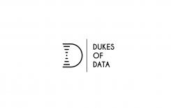
Thanks for your feedback. I tried to simplify the previous logo.
Design a new logo & CI for “Dukes of Data
- Contest holder: DoD´s
- Category: Logo & stationery
- Status: Ended
Start date: 30-07-2018
Ending date: 15-08-2018
It all started with an idea...
A short, interactive guide helped them discover their design style and clearly captured what they needed.
Brandsupply is a platform where creative professionals and businesses collaborate on unique projects and designs.
Clients looking for a new logo or brand identity describe what they need. Designers can then participate in the project via Brandsupply by submitting one or more designs. In the end, the client chooses the design they like best.
Costs vary depending on the type of project — from €169 for a business or project name to €539 for a complete website. The client decides how much they want to pay for the entire project.
Hi Svetlor,
you absolutly did simplify the first logo. This one is so much clearer - but the message of the inner "electronic circuit" is quite unclear.
But we can see that you thought about it, took the feedback and your work improved a lot.
Thanks you for your work so far,
cheers
joe
Hello DoD's,
Thank you for your encouraging feedback ;)
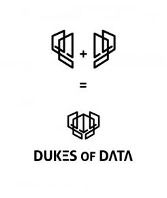
I work on a new logo keeping on the shild as a starting point. The initial shape is made from the repetition of the letter "D" in a dynamic way suggesting a side profil of a man. From the symmetry effect the shape looks like a shild and two side profil men.
Waiting for your helpful feed back.
Hi Svetlor,
thanks for coming up with this idea and your explanations.
Here our honest feedback: It is hard to see the man's face (some of us don't). On the other hand, you put a lot of effort in construction here.
The completed symbol seems to be too complicated, but like a cloud, we could see differnt shapes in it. For me it's a helmet with wings on the sides, another one can discover a transformers head.
So there is to much going on. But we love that you thought about improvement and explore other possibilites. Unfortunatly we just can judge the result and its impression.
Thanks you, keep it going,
cheers
joe
Hello DoD's,
here is my logo proposal. Waiting for your feedback.
Hi Svetlor,
thanks for your entry.
Your logo does have a simple shape and clear structure. I just looked on it and tried to see, if you hide a message in the "usb" lines within the shild, but could not find any :lächeln:
It is a great idea to put a new change in the E of the letters. This make it outstanding.
Thanks a lot for your idea,
keep it going.
Cheers
joe from Dukes of Data.
 Nederland
 België
 France
 Deutschland
 Österreich
 International


