No comments
Design a new logo & CI for “Dukes of Data
- Contest holder: DoD´s
- Category: Logo & stationery
- Status: Ended
Start date: 30-07-2018
Ending date: 15-08-2018
It all started with an idea...
A short, interactive guide helped them discover their design style and clearly captured what they needed.
Brandsupply is a platform where creative professionals and businesses collaborate on unique projects and designs.
Clients looking for a new logo or brand identity describe what they need. Designers can then participate in the project via Brandsupply by submitting one or more designs. In the end, the client chooses the design they like best.
Costs vary depending on the type of project — from €169 for a business or project name to €539 for a complete website. The client decides how much they want to pay for the entire project.
Hi zB,
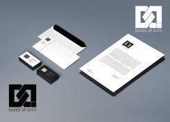
thanks again for showing us the Logo in "wildlife" and how this will come out on paper.
Still looks great and have an impact.
Thanks a lot
cheers
joe
No comments
Hi zB,
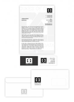
thanks for showing us these possibilities.
It's great to see your logo in action and usage. Great stuff, you did there. Love it.
Cheers
joe
No comments
Hi zB,
thanks for taking our input and show us this version.
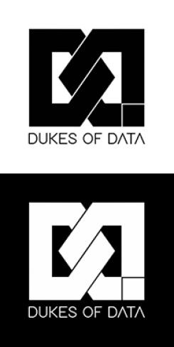
Well this one is a bold call, we like it. It remindes a bit of the DC sneakers logo, but I love the knot in the middle and the box in the right lower corner gives a litte twist.
Thanks a lot
have a nice weekend,
cheers
joe
No comments
Hi zb,
thank you.
This one is a bold statement. It is clear, does stand out and has gravity.
Of all your entries, we like this one most. It contains at least one D, can be a chain-element, does remind me of kettlebells :)
We wonder, if you find a way how this can work without the different greys - without any color gradient?
Thanks
cheers
joe
No comments
Hi zb,
thanks for another proposal.
DDs and a dot :)
Unfortunatly this one does not click with us in any means. It is an interesting way to handle the double D, but it simply does not work.
But thanks for your work and effort,
keep the good work up,
cheers
joe
No comments
Hi zb,
thank you for another idea.
This one is a bold statement - and so different to the other one. Great to see your diversity of ideas.
Unfortunatly the font is not as clear and simple as your first one and the broken ds reminds us of a checkered flag.
We are missing the elegance of the previous logo - so it seems as you are going the wrong direction.
Thanks a lot for showing us something else, anyway.
Cheers
joe
No comments
Hi zb,
thanks for your entry.
This is a quite interesting design, you made. Some of us do love it, others are not touch by any means.
This is a great first try - keep on trying and maybe you can show us some variations.
Thanks a lot
cheers
joe from Dukes of Data
 Nederland
 België
 France
 Deutschland
 Österreich
 International
