No comments
Design a new logo & CI for “Dukes of Data
- Contest holder: DoD´s
- Category: Logo & stationery
- Status: Ended
Start date: 30-07-2018
Ending date: 15-08-2018
It all started with an idea...
A short, interactive guide helped them discover their design style and clearly captured what they needed.
Brandsupply is a platform where creative professionals and businesses collaborate on unique projects and designs.
Clients looking for a new logo or brand identity describe what they need. Designers can then participate in the project via Brandsupply by submitting one or more designs. In the end, the client chooses the design they like best.
Costs vary depending on the type of project — from €169 for a business or project name to €539 for a complete website. The client decides how much they want to pay for the entire project.
No comments
Hi Cherry23,
thanks for this entry.
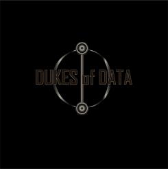
We can see that you explored the O created with the Ds in other ways.
Sorry to say, but it did not wow us. Not really sure, why, but there is no appeal, no sexyness in it.
But keep your head up, let some ideas flow and we would be happy to see more of you in future.
Thanks
cheers
joe
No comments
Hi cherry23,
thanks for your next proposal.
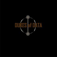
The font is so much better and the clear, nice look is refreshing at all. Nice to see another DD combination in another variant.
But it does not work for us. The double D is too standard. We can see that you tried to create the O in the middle there, but unfortunatly, no.
Definitiv an improvement to the last one,
please keep it going,
cheers
joe
No comments
Hi Cherry23,
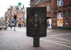
that's a nice picture how it can look on the streets. Maybe this might work with bright lights in the background.
Cheers,
joe
No comments
Hi Cherry23,
the same as in the other logos. Too dark, does not work for us.
Cheers
joe
No comments
Hi Cherry23,
in this one, the font is more visible, but we don't think this one is an appealing font anyway.
Sorry, but thanks for all the variations - it's great to see instead of imagine.
Cheers
joe
No comments
Hi Cherry23,
Wow - this one is hard to see, even if I make the picture bigger on my screen. Way too dark (symbol & font)
Cheers
joe
No comments
Hi Cherry23,
thanks for your entries.
You came up with a new idea - using the D from an older font and combine them to DD.
The shadow/gradient makes it hard to find a clear, polished symbol.
Overall it does not click, sorry.
But thanks for the proposal,
carry on,
cheers
joe from Dukes of Data
 Nederland
 België
 France
 Deutschland
 Österreich
 International
