No comments
Design a new logo & CI for “Dukes of Data
- Contest holder: DoD´s
- Category: Logo & stationery
- Status: Ended
Start date: 30-07-2018
Ending date: 15-08-2018
It all started with an idea...
A short, interactive guide helped them discover their design style and clearly captured what they needed.
Brandsupply is a platform where creative professionals and businesses collaborate on unique projects and designs.
Clients looking for a new logo or brand identity describe what they need. Designers can then participate in the project via Brandsupply by submitting one or more designs. In the end, the client chooses the design they like best.
Costs vary depending on the type of project — from €169 for a business or project name to €539 for a complete website. The client decides how much they want to pay for the entire project.
Hi alonhuigen,
thanks for another one.
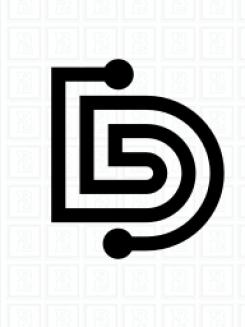
This is more B than D :D
At least is it what we see in here.
Thanks
joe
Hahahaha! DB
...and still one star!
What
No comments
Hi alonhuigen,
thanks a lot for another entry.
This one is so cool simple. The red dot gives an outstanding element and it is nicely done.
But we can not connect our idea to it. So thanks for showing this great idea, but it does not work.
Thanks
cheers
joe
No comments
Hi alonhuigen,
thanks for another idea.
This so so different it is hard to get the shape of the D. The perspective is cool, but no, it does not work.
Thanks a lot
cheers
joe
No comments
Hi alonhuigen,
thanks for this one.
It's a transformation of the wings logo from down there. It is ok, but does not contain any message for us. It just don't connect.
Thanks for sharing
cheers
joe
No comments
Hi alonhuigen,
thanks for that one.
This one is more oldschool, but good.
It looks like you ripped it out of an old book.
Thanks a lot
cheers
joe
No comments
Hi alonhuigen,
thanks for another entry.
The idea of taking only one line is great. But it did not work here. It is hard to remember and nearly impossible to draw it by heart.
Cheers
joe
No comments
Feedback is always welcome ;)
Hi alonhuigen,
and feedback you will get :)
Thanks for this one. There is something in this logo, which was speaking to us. Was it pacman? Was it the versatility? We put it around and it still worked.
Thanks vrey much for this one. Great stuff!
Cheers
joe
Thank you for the feedback
I hope you chose my logo
No comments
Hi alonhuigen,
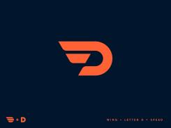
thanks a lot for the winged one.
We can clearly see where this ones comes from. The D and the wings.
It remindes us of Detroit Redwings, of Pain Gaming and other great ones.
But it does not click with us, sorry for that.
Cheers
joe
No comments
Hi alonhuigen,
thanks for this one.
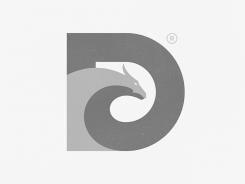
It is stunning great looking. If would fit any fantasy book sooo good, but unfortunatly this does not connect to any of our ideas and businesses.
Cheers
joe
No comments
Hi alonhuigen,
thanks for your next idea.
You tried to get the D into an interesting shape. Well, this did work out in some kind.
Unfortunately this comes out like a wool logo and does not hit us at all.
But it is much more easy to give feedback to something existing and so much harder to tell you, how this would work. Sorry for that.
We really apprechiate all the work you put in here,
cheers
joe
No comments
Hi alonhuigen,
thanks for this one.
Although it is simple, clear lined and comes with a box, it is too military. It's like an emblem of a staff sergant :)
It is great!
We love to see more of you,
cheers
joe
This says dukes of data to the extent that it warrants two stars?
No comments
Hi alonhuigen,
thanks for this idea.
It is a great combination of a statistic diagram and a D. It is simple and carry a message.
But something is missing - it is not standing out and really impress.
But keep it going! You have great new ideas, we have not seen yet.
Cheers
joe
No comments
Hi alonhuigen,
thanks a lot for this one.
The lines are clean and fresh. Unfortunatly it is more a S then a D. So this one will not work.
Cheers
joe
No comments
Hi alonhuigen,
thanks for this entry.
This is another D and O combination, but in a whole new way. Unfortunatly this one does not have a message for us or anything talking to us.
But we do appreciate your work and effort,
cheers
joe
No comments
Hi alonhuigen,
thanks for entering our contest.
Your first proposal is a very cool one. We like the simplicity of the lines, but there is more then a D. We can see an O, we can see a pencil, we can see a canon :)
So this one tells stories, but is clear and shaped.
We are looking forward to see more of you,
cheers
joe
 Nederland
 België
 France
 Deutschland
 Österreich
 International
