No comments
Design a new logo for my healthpractice
- Contest holder: nlleeka
- Category: Logo & stationery
- Status: Ended
- Files: File 1
Start date: 08-02-2016
Ending date: 22-02-2016
It all started with an idea...
A short, interactive guide helped them discover their design style and clearly captured what they needed.
Brandsupply is a platform where creative professionals and businesses collaborate on unique projects and designs.
Clients looking for a new logo or brand identity describe what they need. Designers can then participate in the project via Brandsupply by submitting one or more designs. In the end, the client chooses the design they like best.
Costs vary depending on the type of project — from €169 for a business or project name to €539 for a complete website. The client decides how much they want to pay for the entire project.
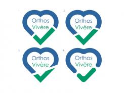
This idea is based on heart-shape with virtual detachment to mimic the check-mark from lower-right in order to read “good health“ (checked, cured etc.). Besides the heart shape as easily recognizable symbol for health, the combination of blue and green as color commonly seen in medical facilities, on wardrobe, signs... is by my opinion a good choice, especially since check-marks are green by default. The colors, font and position of text can be changed as you prefer. I‘ve designed 4 variations, and uploaded them all at once for easier comparing. My favorite is third one (bottom left) with straight line detachment. Please rate and comment if you like the initial idea. I can alter it according to your suggestions.
 Nederland
 België
 France
 Deutschland
 Österreich
 International
