Good morning Els,
attached the logo on a smartphone screen ;)
have a nice sunday & kind regards, Dagmar
Design a strong logo & house style for a new open practice Care 4 Your Health
- Contest holder: Els Keur
- Category: Logo & stationery
- Status: Ended
Start date: 26-11-2017
Ending date: 09-12-2017
It all started with an idea...
A short, interactive guide helped them discover their design style and clearly captured what they needed.
Brandsupply is a platform where creative professionals and businesses collaborate on unique projects and designs.
Clients looking for a new logo or brand identity describe what they need. Designers can then participate in the project via Brandsupply by submitting one or more designs. In the end, the client chooses the design they like best.
Costs vary depending on the type of project — from €169 for a business or project name to €539 for a complete website. The client decides how much they want to pay for the entire project.
Good morning Els,
attached a new idea, curious to hear your opinion ;),
kind regards, Dagmar
Hello, Thank you for your new design. I still prefer 2nd design. Do you have opportunities to display this logo on a phone screen? So that I can see how it happens on a screen. I spoke with a web builder who thought it might be too big for a phone screen. Greeting, Els
Hello Els,
I see what you mean and made another variation of my first idea. Hope this is clearer to recognize ;). Let me hear your opinion,
kind regards, Dagmar
Thank you, Dagmar, I will show it to people again. I can see it, but it's my concern that people understand the name and can immediately start googling with the right name.
But if you have other ideas I like your style ...
Dag Dagmar, your design does not let me go. However, I have again shown people reading the 4 unfortunately not yet. Do you have any idea about that ... furthermore I wonder if the font is not too business-like. Could you show it with a different font. I always come back to your design but it is still not quite .. Thank you for your efforts so far ...
A friendly greeting,
Els
Dear Els,
thank you for your feedback. I will think about it, and will try to figure out a different way. The point is, that I'm not sure, if to sort of bend and stretch this idea of mine, to incorporate an abstract figure using the number 4 as the base, makes sense, or if I should think about a completely different design?
Let me hear your opinion ;),
kind regards, Dagmar
I understand what you are saying. That is, of course, true. Of course, a new design is always allowed. You make beautiful things that you can do with very much. Only it is important to me that people understand the name and they can google it properly. Furthermore, I have indicated that I appeal to a simple design, but that it is approachable. I'm not sure how you explain that in English. Not too tight but kind of sweet. Do you understand what I mean. I find it very difficult to put into words exactly what I mean .. Sorry for that Kind regards,
Els
Hello Dagmar,
Your design will continue to trigger the most. Only now I notice that it appeals to many women and men less while I can and everyone wants to treat. Is there a different color scheme for you? In my objective, I also explained better what Orthomolecular Medicine is about.
Orthomolecular nutritional supplements contain substances (minerals, vitamins, amino acids, fatty acids and bioactive substances) that our body and our brains need to function. These substances also occur in our diet. Eating deficiencies due to mental or physical stress, illness or when the body is unable to absorb nutrients (more) can lead to food shortages.
These deficiencies can be supplemented with nutritional supplements. Also orthomolecular nutritional supplements without a deficiency can have a therapeutic effect.
Phytotherapy is based on herbal extracts.
Regasrd Els
Dear Els,
attached you find the layout with the adjusted payoff in Dutch. I also changed the violet to a more like plum color (quite healthy ;) ) Hope you like it,
kind regards, Dagmar
Hello Dagmar,
I notice that people do not recognize the 4. They do not understand him. I must say that at first I did not recognize him either. I knew it was a four because I had to search for it. I'm afraid that people who do not know my name will not make the link. Unfortunately, people who do know my name do not recognize him.
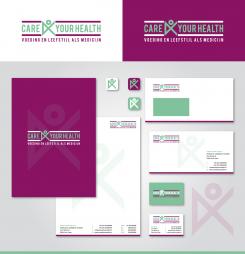
First layout for an according housestyle ;)
Kind regards, Dagmar
Dag Dagmar, Very nice I think I like the light green color most. Is it possible that you just put Voeding en Leefstijl als medicijn in Dutch.It is very difficult for me to choose ..
Good morning Els,
thank you for your positive feedback and rating ;)
Attached a revision including your payoff and another color combination. Are there certain colors you like, that I could use for the housestyle design?
Kind regards, Dagmar
My practice space is white and natural in color. Furthermore, I often find softer colors beautiful.
No comments
Hello, I think you make beautiful designs. See your chance to incorporate Nutrition and Lifestyle as a medicine ? Could you also show this design in other color schemes. I'm curious how you would implement this in a house style.
 Nederland
 België
 France
 Deutschland
 Österreich
 International
