No comments
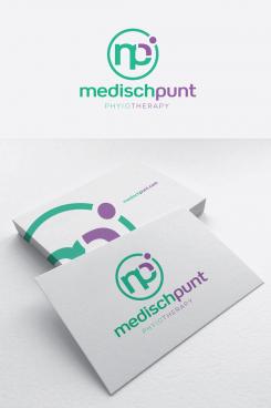
Design logo and corporate identity for Medisch Punt physiotherapie
- Contest holder: medischpunt
- Category: Logo & stationery
- Status: Ended
- Files: File 1
Start date: 02-01-2020
Ending date: 30-01-2020
It all started with an idea...
A short, interactive guide helped them discover their design style and clearly captured what they needed.
Brandsupply is a platform where creative professionals and businesses collaborate on unique projects and designs.
Clients looking for a new logo or brand identity describe what they need. Designers can then participate in the project via Brandsupply by submitting one or more designs. In the end, the client chooses the design they like best.
Costs vary depending on the type of project — from €169 for a business or project name to €539 for a complete website. The client decides how much they want to pay for the entire project.
No comments
Hi, thank you for your design! I like the freshness of this logo. My feedback would be that the letters in the logo in a difficult way make an M and a P. That should be more Obvious or maybe not neccesarily in there
No comments
Hi, thank you for your design! I like the freshness of this logo. My feedback would be that the letters in the logo in a difficult way make an M and a P. That should be more Obvious or maybe not neccesarily in there. However the lettering of this logo is better than the other one
I like the dot that makes a little puppet with the quarter round of the P.
 Nederland
 België
 France
 Deutschland
 Österreich
 International
