Hello Aute,
A few lines to explain why and how I worked on the logo :
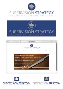
I chose not to incorporate the eye because for me this symbol is mostly used by opticians or any business related to eye condition.
As chess symbol, I preferred the Queen who is the most powerful piece in the game and can move fast in any direction unlike the others pawns.
I didn’t use the brown color in the logo to keep it simple and elegant.
I made a flat design logo, clean and efficient, you can use in a single color, particularly useful to print in B&W (for instance) and more readable (business card or small size documents).
If you like it and/or want some changes or have any question, I can work on it and then we can see for the stationery.
Have a good day !
Jerz
design logo and house style for niche consultancy start-up
- Contest holder: Aute
- Category: Logo & stationery
- Status: Ended
- Files: File 1
Start date: 13-11-2017
Ending date: 27-11-2017
It all started with an idea...
A short, interactive guide helped them discover their design style and clearly captured what they needed.
Brandsupply is a platform where creative professionals and businesses collaborate on unique projects and designs.
Clients looking for a new logo or brand identity describe what they need. Designers can then participate in the project via Brandsupply by submitting one or more designs. In the end, the client chooses the design they like best.
Costs vary depending on the type of project — from €169 for a business or project name to €539 for a complete website. The client decides how much they want to pay for the entire project.
Thanks Jerz! I feel this design is indeed nice and clean, but it is a bit too traditional for me. This is a fine balance (because indeed is must to be to hip and flashy), and personal preference thing, of course.. Thanks for the proposal though, I do appreciate it. Best, Aute
 Nederland
 België
 France
 Deutschland
 Österreich
 International

