design logo and house style for niche consultancy start-up

Start date: 13-11-2017

Ending date: 27-11-2017

Total budget: € 359.00
Latest design
Book cover
solaram

It all started with an idea...

A short, interactive guide helped them discover their design style and clearly captured what they needed.

Needs


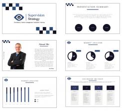
Develop logo and house style for a start-up consultancy and interim management firm, specialised in strategy for government regulators & supervisors (e.g. AFM, NVWA, Onderwijsinspectie, Inspectie Leefomgeving en Transport, milieudiensten) worldwide.

The ambition is to grow within a few years into a network-enabler, the world-wide focal point for knowledge and insight in the area of supervision strategy.

Keywords: customised work (see attached pic, that I use for my website), broad perspective, modern, knowledgeable and reliable. I am looking to strike a balance: on the one hand, the target audience (government regulators, supervisors) is quite conservative, so I do not want to use an extremely hip or young design. On the other hand, the ambition is to add modern insights to their work, so it cannot be too boring or old fashioned either.

See for my current website: supervisionstrategy.com. Would be good to have (one of) these colours in the design.

Note: this enterprise distinguishes itself from other consultants, because it is focused solely on regulation and supervision. It distinguishes itself from other regulation and supervision consultants, because:
- it only works for regulators (serving the public interest), not for commercial (regulated) companies;
- It combines 20 years of experience in supervision practice with a broad and deep knowledge base (law, philosophy, MBA, PhD);
- it is not limited to a technical perspective, but combines many perspectives on the 'regulatory craft'.

Note 2: given the brand name, Supervision Strategy, obviously avoid the abbreviation 'SS'. :)

Many thanks for your proposal!

Company description


Target group


Colors, favourites and other requirements


Designer: artamad artamad
logo_stationery-artamad-dDWq5ACO

No comments

This contest is finished. Its not possible to reply anymore.
logo_stationery-artamad-RffqLlrs

No comments

artamadartamad

Do you need any changes?

AuteAute

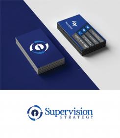
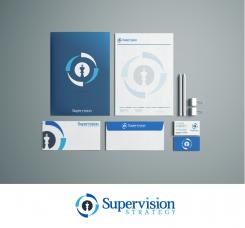
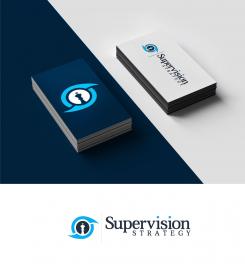
Hi artemad, mostly matters of personal taste: I am not convinced by the light blue color, and not a fan of the light blue dot on the i. Also, the business card does not yet look very professional to me? But I do think this is your best suggestion thus far. Best, Aute

artamadartamad

Hello, This was just a simple mock up everything can be improved/changed. Just showing it on print. In any way, do you want the colors to be changed?

This contest is finished. Its not possible to reply anymore.
logo_stationery-artamad-IOu0Hbzk

No comments

This contest is finished. Its not possible to reply anymore.
logo_stationery-artamad-HmaHTjbk

No comments

This contest is finished. Its not possible to reply anymore.
logo_stationery-artamad-HAGYfrDk

No comments

This contest is finished. Its not possible to reply anymore.
logo_stationery-artamad-GXwprypk

No comments

This contest is finished. Its not possible to reply anymore.
logo_stationery-artamad-qmmDdPX6

No comments

This contest is finished. Its not possible to reply anymore.
logo_stationery-artamad-qASUpX96

No comments

This contest is finished. Its not possible to reply anymore.
logo_stationery-artamad-M53oxp8S

No comments

This contest is finished. Its not possible to reply anymore.