redesign #3
Help me create a professional carousel logo & corporate identity!
- Contest holder: carolineruijg
- Category: Logo & stationery
- Status: Ended
Start date: 03-10-2016
Ending date: 10-10-2016
It all started with an idea...
A short, interactive guide helped them discover their design style and clearly captured what they needed.
Brandsupply is a platform where creative professionals and businesses collaborate on unique projects and designs.
Clients looking for a new logo or brand identity describe what they need. Designers can then participate in the project via Brandsupply by submitting one or more designs. In the end, the client chooses the design they like best.
Costs vary depending on the type of project — from €169 for a business or project name to €539 for a complete website. The client decides how much they want to pay for the entire project.
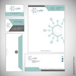
Here are a stationary elements for you.
I did my best for you.
best regards,
m3kdesign
Hi M3k! Thanks I really appreciate your effort!! Just the focus of the logo now seems more on USEL rather than my name CARO!! This is because of the colour! Can you please change the first part and make this grey colour and the second part light blue? I prefer the first three colours (with red) then only blue (cold) thanks a lot for your help ! Best
Also I prefer minimalistic designs. so the business card and corporate identity are a bit too much for me, can you change it with " less is more" so less angels and colour changes in the page? I like the big carousel on the letter but please keep the header simple. thanks!!
Offcourse I can.
Thanks again for constructive feedbacks.
wow you are fast !! I love the duck egg blue colour blue you have used
I uploaded a logo with colour changes. Now is more visible. So, you dont want a shapes in statyonery, just simple and minimalistic creation? Which colour you want to be the most in stationary?
I have done some changes.
How does it look now?
There are some changes you prefer.
More blue vision about all and "C" like a first letter in name logo.
Thank you again for your proffesional feedbacks.
That is so helpfly for me.
best regards,
m3kdesign
Thanks M3 the C looks great now this is what I meant. is there a chance you can write CARO in light blue and USEL in darker blue so the emphasis is more on CARO (referring to my name) thanks a lot!!
No comments
Yes I like the movement you have made here! I prefer the blue footer in the other design more (instead of the four turning wheels) Thanks!
No comments
mooi; abstract en modern en niet kinderachtig! Wat ik ook goed vind is dat er een referentie is gemaakt aan de C van CARO is het mogelijk dit nog iets meer te benadrukken door het logo echt als eerste letter te laten zijn? Of door het groter boven de letters van het bedrijf of can Carousel te laten staan? Alvast bedankt!
Do you understand Dutch?
Hello,
I understand why you want to say. I was in inspiration that is and one "C" and one carousel who is turning. Maybe I can add some effectes and make logo bigger then text. What do you thnik?
Thank you for rating, and your feedback.
best regards,
m3kdesign
Did you see a turning carousel with bird's eye view? Becouse I am trying to illustrate that in one modern way.
Dear M3kdesign, thank you very much for your feedback! Yes I see the birds eye view of the carousel and I think you have done a good job at getting the modern feel for it!! Is it possible to make the logo C bigger so that it becomes the first letter C of CAROUSEL? Do you know what I mean? so I kind of eats the letters like a paceman ;-) Thanks!
 Nederland
 België
 France
 Deutschland
 Österreich
 International
