logo design
IT company in search of corporate design
- Contest holder: Hamburgeria
- Category: Logo & stationery
- Status: Ended
Start date: 05-11-2014
Ending date: 13-11-2014
It all started with an idea...
A short, interactive guide helped them discover their design style and clearly captured what they needed.
Brandsupply is a platform where creative professionals and businesses collaborate on unique projects and designs.
Clients looking for a new logo or brand identity describe what they need. Designers can then participate in the project via Brandsupply by submitting one or more designs. In the end, the client chooses the design they like best.
Costs vary depending on the type of project — from €169 for a business or project name to €539 for a complete website. The client decides how much they want to pay for the entire project.
another adjustment in color and sharpen text
adjusted color... black... is it alright? :)
interesting, can you check the feedback to the previous logo below?
and how about this?..
Interesting with the dot in between :)
How about some changes in the global communications symbol?
1.insert the sketch of the Buffalo here
2. make the background of the circle transparent living just the margin of the O
thank you for all the logo options. Can you insert the buffalo sketch in this logo, I find the lines in the communications symbol finer and the mix of darker and lighter orange nice.
Can you leave only the margins of the communication globe: like a black circle with the inside white/transparent? + the black sketch of the Buffalo (hope I am explaining this properly) :)
sorry i only read this feedback now.. i will catch up later .. yes i can do it .. ill back later
i omit the mustache look horn.. here how about this?
can we switch the places of the colours? BIVOL in black and IT in orange?
oh, actually, can you in this logo option also replace the O in Bivol with the global communication symbol? and also leave it in IT
enclosed with rectangular
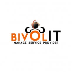
orange and black color with a buffalo horn and a symbolic global communication..
orange black with buffalo horn design and a symbolic global communication
Dear learn88, thank you for this logo. The colour combination look really good. Here is my feedback for this logo-version:
1. At a first glance the horns look like a mustache, so the best idea is to A. omit them B. use them otherwise or C. design them a bit different?
2. The symbol of global communication is a good addition. Here are 2 options I would like to see them in:
A. use it instead of O in BIVOL
B. use it in I - keep the upper case for the I (or maybe make it smaller than BIVOL) and place the symbol on top?
C. place the symbol somewhere else?
3. omit manage service provider
Thank you
okay :) i try to make what you have suggested
 Nederland
 België
 France
 Deutschland
 Österreich
 International
