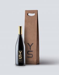
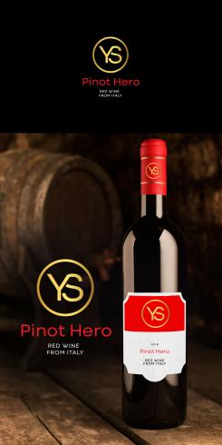
hello
here's another revisions :)
regards
philart
Label for a chilled Pinot Nero Red Wine from Italy
- Contest holder: douwe schoemaker
- Category: Logo & stationery
- Status: Ended
Start date: 29-03-2020
Ending date: 11-04-2020
It all started with an idea...
A short, interactive guide helped them discover their design style and clearly captured what they needed.
Brandsupply is a platform where creative professionals and businesses collaborate on unique projects and designs.
Clients looking for a new logo or brand identity describe what they need. Designers can then participate in the project via Brandsupply by submitting one or more designs. In the end, the client chooses the design they like best.
Costs vary depending on the type of project — from €169 for a business or project name to €539 for a complete website. The client decides how much they want to pay for the entire project.
Haha nice word play with hero. However still the design seems a bit cheap. Really nice design for a cheaper bottle in the store. You should do something with it.
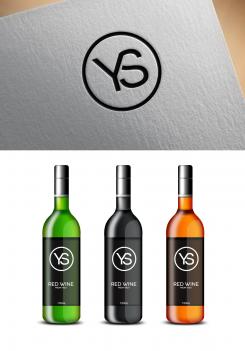
hello
here's my logo design combination of simplicity and clean logo design.
regards
philart
Like your style! I like the simplicity. However this is not a bottle if you look at it as if you want to pay 40 euro for it. It should be more high-end
 Nederland
 België
 France
 Deutschland
 Österreich
 International


