No comments
Legal advice office logo + style
- Contest holder: superswiegie
- Category: Logo & stationery
- Status: Ended
Start date: 16-09-2012
Ending date: 25-09-2012
It all started with an idea...
A short, interactive guide helped them discover their design style and clearly captured what they needed.
Brandsupply is a platform where creative professionals and businesses collaborate on unique projects and designs.
Clients looking for a new logo or brand identity describe what they need. Designers can then participate in the project via Brandsupply by submitting one or more designs. In the end, the client chooses the design they like best.
Costs vary depending on the type of project — from €169 for a business or project name to €539 for a complete website. The client decides how much they want to pay for the entire project.
No comments
I'll give comments on this one this evening.
This evening has become a long night. I am glad that you chose the design below. That design I find very nice. (considering it now Saturday) I will give my final finding tomorrow.
No comments
This one is nice as wel. good job. I want to make a dessision this weekend. So i'll post my findings on the discussion page.
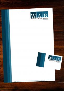
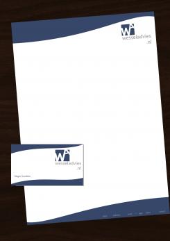
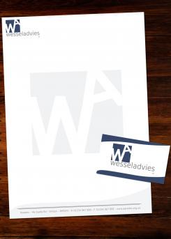
Would you like me to make a overall design for this too, letterhead etc, give you more of an idea?
Yes please.
No comments
thank you. I like this design, could you make a overall design? (letter head, card envelop)
No comments
This proposal is much better, I like the image. I have to make up my mind about the letter positions. Could you add as subtitel "juridisch advies"?
No comments
ik vind de kleur blauw erg goed. Nu het lettertype iets strakker is denk ik dat het wat beter past bij de sleutelwoorden. Wel vraag ik mij af of de tekst niet te vullend is. Hiermee bedoel het kaartje wel als doel moet hebben om mijn naam te dragen.
wellicht zou dit op de achterkant kunnen, maar ik weet niet of ik dat mooi vind.
Wat zou jouw suggestie zijn?
On the business card design, yes all your business details would be on the back. Or I could adjust the design so all the details are on the front if thats what you would prefer?
I would like to see what it looks like if the business card has my name on the front, perhaps with a small version of the logo? The back would then have my business information.
Yeah ok, I will try this for you. What is your name you would like on?
http://on.fb.me/NxiMe2
There you can find my name
I am trying to avoid having brandsupply as a first google hit
No comments
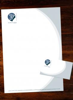
Het kaartje ziet er goed uit, ik vind de blauwe beweging leuk ook spreekt het font mij meer aan. Wel vind ik het grijze logo op de achtergrond het brief papier wat onrustig maken.
I could add the blue, wavy lines to the letterhead to if you would like?
Goodday,
Sorry for the dutch comments,
Could you delete the WA gray background in the letter,
And yes show me the wavy lines in the letterhead.
Thanks for your suggestions.
Its ok, and yes I will do this for you asap.
No comments
Bedankt voor je inzending. Dit eerste logo spreekt mij aan maar ben benieuwd hoe het staat met een ander lettertype? Iets strakker.
Zou je ook kunnen laten zien hoe dit staat als briefhoofd?
 Nederland
 België
 France
 Deutschland
 Österreich
 International
