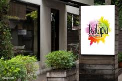
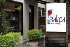
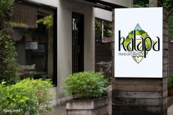
Another arrangement of the circle, if you prefer. :)
Logo and Branding for KALAPA Herbal Elixirbar
- Contest holder: KALAPA
- Category: Logo & stationery
- Status: Ended
- Files: File 1, File 2, File 3
Start date: 26-02-2020
Ending date: 18-03-2020
It all started with an idea...
A short, interactive guide helped them discover their design style and clearly captured what they needed.
Brandsupply is a platform where creative professionals and businesses collaborate on unique projects and designs.
Clients looking for a new logo or brand identity describe what they need. Designers can then participate in the project via Brandsupply by submitting one or more designs. In the end, the client chooses the design they like best.
Costs vary depending on the type of project — from €169 for a business or project name to €539 for a complete website. The client decides how much they want to pay for the entire project.
So same concept, pretty different colors (also part of the magic-like color palette) - do you already have any preferences about the colors - do you like to have purple, green or blue, or any other?
Dear Studio Heather,
Thank you so much for all your designs and work! You've created lot of beautiful artworks.
Although I think it is too complicated to use as a logo.
Its a difficult choice but I I think I will move on with another design so you dont have to put more effort in it for now.
Let me know what you think of this version. What other element do we need to add?
I could use more colors, too, but it depends on what printing solutions you will use and pay for afterwards.
I could use more colors, too, but it depends on what printing solutions you will use and pay for afterwards.
haha I see where you got this idea from and you listened to the feedback i gave there. that is a smart move ;). hmm I like the idea, yes colours need to be different and also the fond. But at this moment I saw so many different things.. I have to let it sink a little to be able to give the right feedback... Its not easy this process of choosing a logo haha
Thank you for your feedback. First, I should tell you that there is a huge difference between a drawing/illustration and a logo. This here is closer to a logo.
I say this as a marketing specialist with 10 years of experience. So you not only should like the style of the drawing and the colors, but also look at this as a brand and also people must be able to notice easily your logo from a distance. So if we draw faces, they should be easy to recognize. Also, we would like to associate the brand name with the meaning of that "kalapa state of mind", otherwise there is the name you chose makes no sense to people who meditate. That is why we use geometric forms representing the meditation culture. I will now upload same concept with a bit different color palette and font. But please, let me know what colors you would like and also if I need to work on this concept at all or if I need to stop, because I have lots of work and little time. If you already prefer another concept, I should stop spend time working on this logo. Thank you! :)
Here is 1 of my 3 concepts, put on a signboard
Here is 1 of my 3 concepts, put on a signboard
Here is 1 of my 3 concepts, put on a signboard
Here is another color palette (Chakra colors) for the 2nd concept that you have already seen and replied to.
Here is the third one, another concept based on the flasks you might use aat your bar. And I try to use color palette close to the Chakra colors. Which of the 3 you prefer more so that I can develop in the right direction. Do you like this meditation font as it is called?
Second proposal by me. The third one will be ready a bit later.
Thanks! im very curious for your third one :) both of these are interesting. Not completely what im looking for but you're in the right direction.
 Nederland
 België
 France
 Deutschland
 Österreich
 International
