Logo:
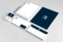
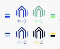
- Pictogram built vertically, which provides a sense of growth and stability. The double roofs suggest the idea of shelter, protection, trustworthiness and solidity.
Name:
- "flex" in lowercase modified HelveticaNeue light
- "ID" in uppercase modified HelveticaNeue bold, to stress on the ID part on the logo.
Colours:
- I suggest using a dark grey or black to begin with, but i've added samples of colours which can be used for further usage
App:
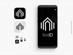
- The logo is built so that it can be used as an icon for a smartphone app.
Feel free to give your feedback,
Best regards,
Kieran BURR
Logo and corparate identity FlexID
- Contest holder: FlexID
- Category: Logo & stationery
- Status: Ended
Start date: 01-09-2018
Ending date: 08-09-2018
It all started with an idea...
A short, interactive guide helped them discover their design style and clearly captured what they needed.
Brandsupply is a platform where creative professionals and businesses collaborate on unique projects and designs.
Clients looking for a new logo or brand identity describe what they need. Designers can then participate in the project via Brandsupply by submitting one or more designs. In the end, the client chooses the design they like best.
Costs vary depending on the type of project — from €169 for a business or project name to €539 for a complete website. The client decides how much they want to pay for the entire project.
Logo:
- Pictogram built vertically, which provides a sense of growth and stability. The double roofs suggest the idea of shelter, protection, trustworthiness and solidity.
Name:
- "flex" in lowercase modified HelveticaNeue light
- "ID" in uppercase modified HelveticaNeue bold, to stress on the ID part on the logo.
Colours:
- I suggest using a dark grey or black to begin with, but i've added samples of colours which can be used for further usage
App:
- The logo is built so that it can be used as an icon for a smartphone app.
Feel free to give your feedback,
Best regards,
Kieran BURR
 Nederland
 België
 France
 Deutschland
 Österreich
 International


