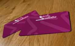
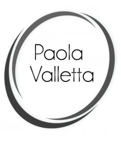
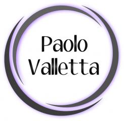
3D something like this? I deleted the purple shadow. You asked me to use the "Kerater" font but i'm not able to put it in the logo because I have to buy it for 59$. I used an font that looks like the "Kerater" font.
Logo and Corporate Design for New Fashionbrand
- Contest holder: paolovalletta
- Category: Logo & stationery
- Status: Ended
- Files: File 1, File 2, File 3
Start date: 08-05-2012
Ending date: 18-05-2012
It all started with an idea...
A short, interactive guide helped them discover their design style and clearly captured what they needed.
Brandsupply is a platform where creative professionals and businesses collaborate on unique projects and designs.
Clients looking for a new logo or brand identity describe what they need. Designers can then participate in the project via Brandsupply by submitting one or more designs. In the end, the client chooses the design they like best.
Costs vary depending on the type of project — from €169 for a business or project name to €539 for a complete website. The client decides how much they want to pay for the entire project.
yes, thanks, for your efforts. Well, it still looks teenage, im sorry. maybe other design...more timeless...
Same logo, but now with an other font and a little bit less shadow.
this fonttype looks to bold, no bold fonttype, but im looking for a timeless, but yet modern font.
o=333300&bg=ffffff&sh=false&s=55&f=denigan
can you use this font??
i mean this font:
http://www.mawns.com/wordpress/font/?font=kerater
I hope you like it, i'm waiting for your response.
yes, its great. It difficult to decide at the moment. can you try more 3D designs, like this, but bit more -timeless-. This looks bit teenage, trendy, thats not what Id like to communicate through a logo. Use tones of grey. Delete the shade purple.
 Nederland
 België
 France
 Deutschland
 Österreich
 International


