No comments
Logo and corporate identity for a purpose oriented startup that focuses on organizational development
- Contest holder: YourPurpose
- Category: Logo & stationery
- Status: Ended
- Files: File 1, File 2, File 3
Start date: 30-09-2017
Ending date: 07-10-2017
It all started with an idea...
A short, interactive guide helped them discover their design style and clearly captured what they needed.
Brandsupply is a platform where creative professionals and businesses collaborate on unique projects and designs.
Clients looking for a new logo or brand identity describe what they need. Designers can then participate in the project via Brandsupply by submitting one or more designs. In the end, the client chooses the design they like best.
Costs vary depending on the type of project — from €169 for a business or project name to €539 for a complete website. The client decides how much they want to pay for the entire project.
Hello,
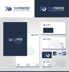
here logo with blue color (facebook).
The color before that was : #00a79d
Let me know if you want to make some other changes.
Regards,
Krisi
Thanks again Krisi. Looks really nice as well. I think I prefer the green version, but will show both to my business partner. This will probably not be earlier than Monday. I shall keep you informed! Have a nice weekend.
Thank you!
You too.
No comments
Hello,
here example with new tagline.
Let me know if you want to make some other changes.
Regards,
Krisi
Thanks Krisi. Looks great now. Tomorrow I shall have a closer look on the design together with my business partner
Thank you!
Let me know if I can be more helpful.
Regards,
Krisi
Hi Krisi. End of the day will be the closing of the contest and as you know, we really like your design. Could you do us a favor by showing us a few more possibilities. First: a change of the tagline (again .... ;-) ) Could you put there " Your Values . Boosted . Shared. " Second: We really like the green color (what color is this?), but would also like to see the design in a combination of the colors blue and grey (and white). So change the green color for blue, e.g. the blue color that is used in the Facebook logo. Sorry for the inconvenience, but you can probably understand it, for it is really important for us to make the right choice.
No comments
Thanks Krisi. I showed it to a couple of people yesterday and they liked it as well. One remark I got was, that there could be confusion when people read the name. They could read " Our Purpose", instead of "Your Purpose" if they don't understand the way the "Y" is used. We have to think about that. Maybe it is anyhow better not to use the figure as a letter. What do you think?
Hello,
I don't think this is a problem...I ask few people around me how they read it and everyone read "Your Purpose". If I write it "Your Purpose" after image logo it start to looks like double "Y".The other option is to show you how it'll looks stationery deign with logo above name.
Let me know what do you think.
Regards,
Krisi
You are probably right. After all, you are the designer ;-). Could you put the text "Build values from a vision" or "Values from a vision" as the tagline?
No comments
Hello,
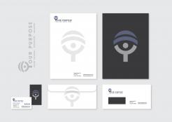
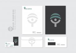
here my proposal for stationery design.
Let me know what do you think.
Regards,
Krisi
Very promising Krisi. I think I like to have the tagline below the company name. Could you arrange that, maintaining the balance in the logo?
No comments
Hello,
I make you to other versions.
Let me know what do you think.
Regards,
Krisi
Using the logo figure as a Y in the text is very creative. I like it. Could you show what this design would look like on business cards, stationary etc.
Thank you.
I will prepare stationery design.
Regards,
Krisi
No comments
The lines give the whole picture a much better balance.
No comments
Je bent de eerste! Mooi ontwerp en goed in lijn met onze verwachtingen. Ik wacht nog even met de beoordeling tot ik wat vergelijkingsmateriaal heb.
Thank you for your feedback.
Let me know if I can be more helpful.
Regards,
Krisi
Hi Krisi.We like the colors, the font en also the logo figure. But we think the whole picture is not yet in balance. Would it be possible to rearrange the logo, to improve the balance?
 Nederland
 België
 France
 Deutschland
 Österreich
 International
