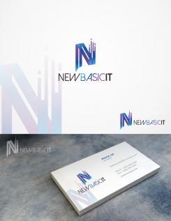
hi..
On this logo you can use only icon, icon with text "newbasicit", and combination between icon & text just like in the preview.
Logo and corporate identity for a starting IT company reseller
- Contest holder: FrankW
- Category: Logo & stationery
- Status: Ended
Start date: 01-04-2019
Ending date: 08-04-2019
It all started with an idea...
A short, interactive guide helped them discover their design style and clearly captured what they needed.
Brandsupply is a platform where creative professionals and businesses collaborate on unique projects and designs.
Clients looking for a new logo or brand identity describe what they need. Designers can then participate in the project via Brandsupply by submitting one or more designs. In the end, the client chooses the design they like best.
Costs vary depending on the type of project — from €169 for a business or project name to €539 for a complete website. The client decides how much they want to pay for the entire project.
No comments
Ok then we do it in English: D
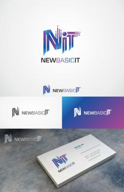
I like this setup with the N as first and then new basic behind it. I just want to see the IT part a little bigger.
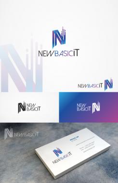
N newbaisicIT. Just like you came up with the 1st example. side by side, but then IT is slightly larger. I can possibly use that logo for my signature and the other logo for the website. The color combination is good
Thanks in advance!
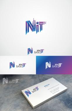
Hi, i'll make the "it" more iconic, so maybe it'll have 2 icon on a logo at the same time.
Is that OK about logo "newbasicit" with N after it (the black-white logo)?
look down below :)
No comments
Ziet er cool uit. Zou je bij het logo, waarbij het naast elkaar staat IT een beetje kunnen vergroten. Op deze manier springt het gedeelte IT er iets meer uit. Vind de opzet met de letter N heel cool. Je legt hiermee de nadruk op nieuw en fris in combi met de kleuren. Ben benieuwd!
hallo ..
bedankt voor het compliment.
het spijt me, maar ik begrijp genoeg in het Engels. ^^
Ik heb een concept verzonden met een andere lay-out voor logo en schrijven. Ik hoop dat je het leuk vindt.
No its ths "newbasicit" with the N before it and the blue purple logo :) then only IT something bigger, then it looks just the way I like it
 Nederland
 België
 France
 Deutschland
 Österreich
 International
