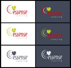
Logo variation
Logo and Design for Catering Company
- Contest holder: mvirmond
- Category: Logo & stationery
- Status: Ended
Start date: 02-10-2012
Ending date: 12-10-2012
It all started with an idea...
A short, interactive guide helped them discover their design style and clearly captured what they needed.
Brandsupply is a platform where creative professionals and businesses collaborate on unique projects and designs.
Clients looking for a new logo or brand identity describe what they need. Designers can then participate in the project via Brandsupply by submitting one or more designs. In the end, the client chooses the design they like best.
Costs vary depending on the type of project — from €169 for a business or project name to €539 for a complete website. The client decides how much they want to pay for the entire project.
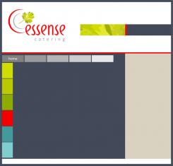
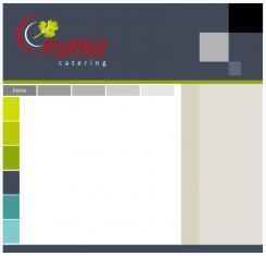
Color Scheme for website
that could work - nice
what if we were to do a white header and footer instead? I like that combination as well
No comments
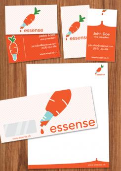
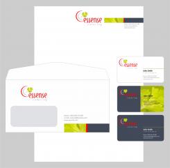
very nice. i didn't actually ask for an envelope design but I appreciate the effort.
nice idea with the coriander/red/grey bar. I like it.
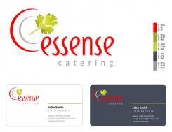
This is a logo and business card. I work and materials. Tell me if I'm going in the right direction in terms of color
you do. i think the strong red and green contrast nicely with each other, both on the white and the grey background. looks very professional.
I also quite like the business card design. not too crowded, clean, professional. nice job.
I am unsure about the color scheme. I mean I like the colors but I am wondering: for designing the website I assume I might need some more subtle colors as well (for backgrounds for example). otherwise pretty good!
No comments
the upper version is quite nice - one of my absolute favorites so far.
Love the coriander leaf and the hint of a plate logo - very fresh, very subtle.
and a nice font. Maybe you can make the colors a bit more powerful (that's what I liked about the other design with the grey/red colors).
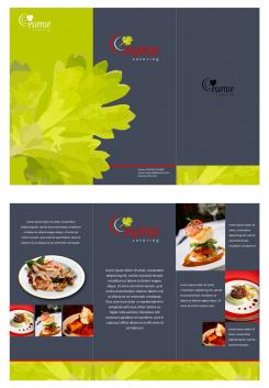
Apart from that, I would suggest you expand the design into the full set (colors, business cards etc.).
the lower version is a bit boring I find.
No comments
Great style as well. Overall, I like the later version better. But maybe there's a merged version of the two. I find it very nice how the leaf sticks out of the e. plus I love the colors of the lower version - very powerful.
No comments
love the hand written font style - but not the logo
again, maybe you can make something more of the hand drawn style. I think that's very up to date. But overall, the logo won't make final selection
 Nederland
 België
 France
 Deutschland
 Österreich
 International
