No comments
Logo and Design for Catering Company
- Contest holder: mvirmond
- Category: Logo & stationery
- Status: Ended
Start date: 02-10-2012
Ending date: 12-10-2012
It all started with an idea...
A short, interactive guide helped them discover their design style and clearly captured what they needed.
Brandsupply is a platform where creative professionals and businesses collaborate on unique projects and designs.
Clients looking for a new logo or brand identity describe what they need. Designers can then participate in the project via Brandsupply by submitting one or more designs. In the end, the client chooses the design they like best.
Costs vary depending on the type of project — from €169 for a business or project name to €539 for a complete website. The client decides how much they want to pay for the entire project.
not bad, but won't make it in the final selection. just don't like it enough
some updates, do you have feedback?
don't really like the logo that much
some updates, and would like to get feedback.
leave and computermouse concept
not sure i recognize them.
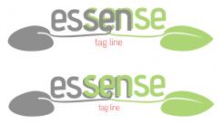
I'm curious if the concept of a mouse and a leave in the same shape fits with your vision and wishes. Let me know if you like this concept to be developed.
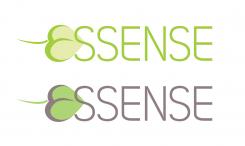
i like the very subtle design of leaf and mouse. maybe switch them around (mouse on the left, leaf on the right), since that would like the logical order to me (order first, the receive leafy salad...).
food online will not be our slogan or subtitle. not sure why, but we just don't quite like it, despite the simplicity and clear message.
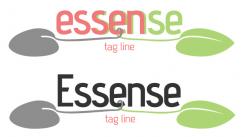
Plus i think the font for essense could become more interesting
No comments
not sure i like the tilted letters and the different style of "s"s
No comments
there's something about the silverplate in general that we don't like, despite it being such an obvious reference to high end catering. maybe it's just too old fashioned.
No comments
too much of an impression of hot food I'm afraid. and it somehow leaves a slightly asian impression on me. otherwise nice.
 Nederland
 België
 France
 Deutschland
 Österreich
 International
