No comments
Logo and housestyle for a start-up consultancy - Ethics at Work
- Contest holder: bartamsterdam
- Category: Logo & stationery
- Status: Ended
Start date: 26-02-2012
Ending date: 07-03-2012
It all started with an idea...
A short, interactive guide helped them discover their design style and clearly captured what they needed.
Brandsupply is a platform where creative professionals and businesses collaborate on unique projects and designs.
Clients looking for a new logo or brand identity describe what they need. Designers can then participate in the project via Brandsupply by submitting one or more designs. In the end, the client chooses the design they like best.
Costs vary depending on the type of project — from €169 for a business or project name to €539 for a complete website. The client decides how much they want to pay for the entire project.
Ethics
Sorry, this doesn't work for me. The T in at looks like a crucifix.
Here another logo design. I hope you like this one :)
What do u think about this? I am trying to find something fitting in you're taste and then working on the business card etc.
Graphicraven.nl
I still like your first proposal more than the ones you have submitted after. I'm not a fan of the @ character.
A bigger resolution. So u can get a better impression of the typeface, logo and colors.
Sincerely
Graphicraven
Thank you for this. I don't really like the added logo. It makes the image a bit to cluttered for my taste. From the things you have submitted so far I like your first proposal (the blue and black name with the sans serif typeface) the most.
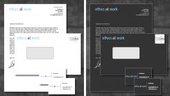
I used a edited modern sans-serif typeface in this design. With a small logo embedded in the design.
Graphicraven
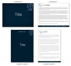
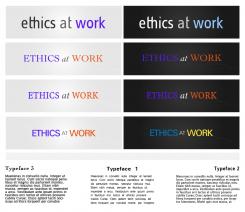
I made a few different designs with different fonts, colors and positioning, including how i would use the typeface in a document.
Do you prefer to have a little logo? As example for the business cards? Or do you prefer a logo edited in to the initial logo : ethics at work.
Sincerely,
Graphicraven
info@graphicraven.nl
I prefer lower case to upper case. In general I like sans serif typefaces or the more modern looking serif types. Light blue, white and orange are ok, I am less of a fan of purple and yellow.
Dear Ethics @ work,
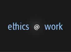
I here by present my work for you're company logo. As you can see there no real logo in it. It is a text-face customized for you're company.
I will work on the powerpoint if u're satisfied with the initial logo i made.
I hope you enjoy seeing it!
Sincerely,
Graphicraven
Dear Graphicraven,
I quite like the direction in which it's going. Could you experiment a bit with other typefaces and shapes?
Kind regards,
Bart
 Nederland
 België
 France
 Deutschland
 Österreich
 International
