No comments
Logo for my therapy practice LICHT BIJ VERLIES Light at loss
- Contest holder: ArnievanVegchel
- Category: Logo & stationery
- Status: Ended
- Files: File 1
Start date: 01-10-2019
Ending date: 08-10-2019
It all started with an idea...
A short, interactive guide helped them discover their design style and clearly captured what they needed.
Brandsupply is a platform where creative professionals and businesses collaborate on unique projects and designs.
Clients looking for a new logo or brand identity describe what they need. Designers can then participate in the project via Brandsupply by submitting one or more designs. In the end, the client chooses the design they like best.
Costs vary depending on the type of project — from €169 for a business or project name to €539 for a complete website. The client decides how much they want to pay for the entire project.
No comments
Yes! I like it like this.
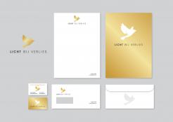
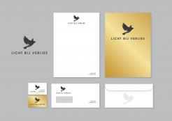
But I would like the quote on the business card on top (above the bird) and maybe add my job title under my name, which is: psychosociaal therapeut.
No comments
And this is also a version... white bird on gold background
Thank you, Krisi. This is also nice, but more as an extra second version, which can be used on letters or business card. When I think of the website version, it is not very practical.
But your design is still one of my favorites. Very simple, stylish, elegant.
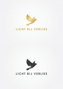
The only thing I would change is the letters: 'bij verlies' in lighter style, so that the emphasis is on 'licht'.
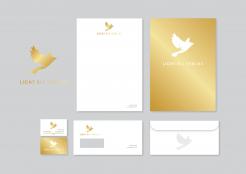
And maybe you could try to make or leave the bird in gold and the letters in black or (dark)grey?
No comments
Als ik deze variant zie, dan vond ik de zwarte vogel met gouden achtergrond toch mooier. Weet alleen niet of dat gaat werken op briefpapier of website...
You can print it with gold if you want.... and for website it's also not a problem... but if you prefer it black not a problem. Let me know if I can do something more for you.
Regards,
Krisi
No comments
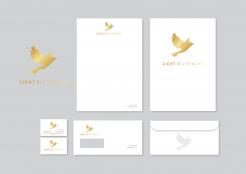
Dit maakt het compleet inderdaad. Mooi.
Ik vind alleen de vogel in het goud mooier, aangezien daar het licht wat meer tot z'n recht komt.
Verder zou ik 'bij verlies' wat lichter of dunnere letters (niet dikgedrukt bedoel ik) willen zien, zodat de nadruk komt op 'licht'.
 Nederland
 België
 France
 Deutschland
 Österreich
 International
