Hi,
Glad that you like the amend logo :)
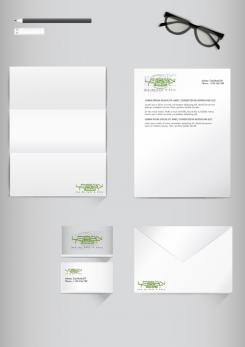
Here is stationary Mockup presentation
Waiting for your response :)
Kind Regards,
Rashid :)
Logo + homestyle for urban pop up cafe in industrial warehouse
- Contest holder: Jelders
- Category: Logo & stationery
- Status: Ended
- Files: File 1, File 2, File 3
Start date: 01-10-2016
Ending date: 08-10-2016
It all started with an idea...
A short, interactive guide helped them discover their design style and clearly captured what they needed.
Brandsupply is a platform where creative professionals and businesses collaborate on unique projects and designs.
Clients looking for a new logo or brand identity describe what they need. Designers can then participate in the project via Brandsupply by submitting one or more designs. In the end, the client chooses the design they like best.
Costs vary depending on the type of project — from €169 for a business or project name to €539 for a complete website. The client decides how much they want to pay for the entire project.
Hi Rashid, Thank you so much, i really like it alot but will go with the proposal of NataS. Thanks alot for your efforts and participation!!
Hi,
Here I have presented the amend logo for Urban Nest.
Do let me know if you have any changes in mind with this concept.
Kind Regards,
Rashid :)
Hi,
Here I have presented the amend logo for Urban Nest.
Do let me know if you have any changes in mind with this concept.
Kind Regards,
Rashid :)
Hi Rashid, I really like this one a lot! This would be my favourite design of all your logo proposals :-)
Could you show me a koch of the house style for business cards and stationary?
Hi,
Here I have presented the amend logo for Urban Nest.
Do let me know if you have any changes in mind with this concept.
Kind Regards,
Rashid :)
Hi,
Here is the amend logo for Urban Nest.
Have presented in mockup style in order to give an idea how will it look when used for Print.
Please let me know your views and do let know if you want any changes in the colour or design.
Kind Regards,
Rashid :)
Really like how the green colour pops up in the mockup with the white ground background.
Hi,
Here I have presented the amend logo for Urban Nest.
Do let me know if you have any changes in mind with this concept.
Kind Regards,
Rashid :)
Hi Rashid,
Thank you!! I really like this green colour and the background! The only thing I just noticed is that the nest after the wod " nest" looks like it spells " nestO", so I prefer to remove it to avoid confusion. Can you maybe put the nest symbol before the " nest" to see how it looks. Or is there another way to add the " nest " by making it a round logo? Thanks so much!
Hi,
Here I have presented the amend logo for Urban Nest.
Do let me know if you have any changes in mind with this concept.
Kind Regards,
Rashid
Hi :) I hope you find this logo to your liking :)
Hi Rashid, thank you for your participation and your idea for the logo. I really like the shape of the Nest and the grey one in this one, but prefer the letter fond more like the other one proposal.
Also can you add some detail of a brick wall or industrial touch? THanks! Looking forward to receive the new version! :-)
 Nederland
 België
 France
 Deutschland
 Österreich
 International
