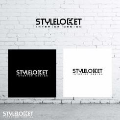
Hi Joanne,
As you asked to me for it, I modified the font of Interior Design" so that is a little more visible. In bold face for the first one, above for the second and down for the last one. I hope that it will suit you more.
Logo & stationary voor hip, trendy, urban en nonchalante INTERIOR DESIGN bedrijf
- Contest holder: jhannant
- Category: Logo & stationery
- Status: Ended
- Files: File 1
Start date: 23-06-2017
Ending date: 13-07-2017
It all started with an idea...
A short, interactive guide helped them discover their design style and clearly captured what they needed.
Brandsupply is a platform where creative professionals and businesses collaborate on unique projects and designs.
Clients looking for a new logo or brand identity describe what they need. Designers can then participate in the project via Brandsupply by submitting one or more designs. In the end, the client chooses the design they like best.
Costs vary depending on the type of project — from €169 for a business or project name to €539 for a complete website. The client decides how much they want to pay for the entire project.
Hi Ludo,
Thanks for adjusting so the words are a little bit better readable.
How are you getting along with the proposals for a business card, a background for letters and lay-out for Color overviews, Material Overviews, etc. I added an example of a template for such overviews to my uploaded files. I would be interested in seeing what you come up with.
Many thanks,
Joanne
No comments
HI Ludo,
Thanks for this option. My only worry is that the wording "INTERIOR DESIGN" is not readable enough, especially if you would place the logo on a business card for example. Could you think of and propose a solution for that?
I would also be interested in seeing some proposals for example a business card, or background of paper I would use to print out Color overviews & Material overviews for an interior styling plan. I have added an example document as well. Thanks in advance!
Joanne
No comments
beetje moeilijk leesbaar, maar wel grappig!
I found that nice also.
No comments
I like the idea of doing something with one of the letters. I'm not too sure though if this is THE one yet. But definitely like the idea!
No comments
Thanks for the try. Can't really tell what I don't like about it, guess it's just the font which is not my taste. Thanks though!
Thanks for the try. Can't really tell what I don't like about it, guess it's just the font which is not my taste. Thanks though!
No comments
don't like the letters, difficult to read
Yes, I think so too.
No comments
I like the 'sketchy' look and feel of the way Styleloket is written. Quite stylish! Thanks! Would be interested in seeing a different option where the horizontal line is not going through the letter S as much as it is doing now.
No problem, I make you that.
 Nederland
 België
 France
 Deutschland
 Österreich
 International
