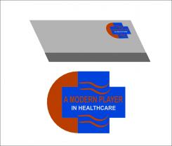
A rectangular-based writing logo specially created for innea writing in soft colors illustrates peace
Modern corporate identity for a modern player in healthcare
- Contest holder: autoklaven-shop
- Category: Logo & stationery
- Status: Ended
Start date: 10-08-2020
Ending date: 26-08-2020
It all started with an idea...
A short, interactive guide helped them discover their design style and clearly captured what they needed.
Brandsupply is a platform where creative professionals and businesses collaborate on unique projects and designs.
Clients looking for a new logo or brand identity describe what they need. Designers can then participate in the project via Brandsupply by submitting one or more designs. In the end, the client chooses the design they like best.
Costs vary depending on the type of project — from €169 for a business or project name to €539 for a complete website. The client decides how much they want to pay for the entire project.
No comments
Hi sujiman,
We have (just) decided we would like a logo without obvious signs of healthcare, so if you could make a logo without the hands and circle, we would be grateful. We would like the logo to show more softness and modernness.
Thank you for your advice.
The logo symbolizes two hands that beg for health. The circle is the hope to be achieved.
For better design please leave suggestion for improvement.
No comments
Hi sujiman,
Thank you for your design. We would like our logo to have our brand "Innea" in it. I think the use of a plus sign in is a bit too old-fashioned in the medical industry, we want to express are more modern brand. I think the logo is also not modern enough.
A small tip: if you want to show how it could look on a business card, look up Business card psd template on google and put the design in there.
 Nederland
 België
 France
 Deutschland
 Österreich
 International
