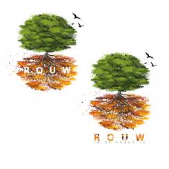
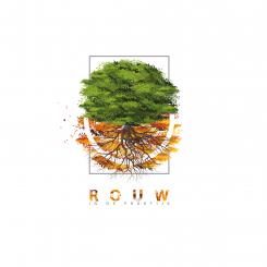
Thank you for your appreciation. The name is less visible than before if we move the name in the brown leaves. So, I still put the other design to you to see the difference. Hoping that you would like the new one.
Mourning in practice is looking for a warm comforting but also positive logo corporate identity
- Contest holder: deesengene
- Category: Logo & stationery
- Status: Ended
Start date: 20-05-2020
Ending date: 29-05-2020
It all started with an idea...
A short, interactive guide helped them discover their design style and clearly captured what they needed.
Brandsupply is a platform where creative professionals and businesses collaborate on unique projects and designs.
Clients looking for a new logo or brand identity describe what they need. Designers can then participate in the project via Brandsupply by submitting one or more designs. In the end, the client chooses the design they like best.
Costs vary depending on the type of project — from €169 for a business or project name to €539 for a complete website. The client decides how much they want to pay for the entire project.
I like this one better. I'll wait for more desings because i'm not convinced that this is what i want. It is a rather busy logo with many leaves and colors. I think a little bit to busy for what i want. But i like the fact that you see the different seasons.
No comments
This is interesting. Different but nice. Could you take out the square line around the logo and the white cirkel? And put my name in white in the roots/brown leaves? I'm wondering what that would look like. Then it's a kind of a round logo. And maybe ad three flying little birds on the right next to the green leaves?
This is interesting. Different but nice. Could you take out the square line around the logo and the white cirkel? And put my name in white in the roots/brown leaves? I'm wondering what that would look like. Then it's a kind of a round logo. And maybe ad three flying little birds on the right next to the green leaves?
This is interesting. Different but nice. Could you take out the square line around the logo and the white cirkel? And put my name in white in the roots/brown leaves? I'm wondering what that would look like. Then it's a kind of a round logo. And maybe ad three flying little birds on the right next to the green leaves?
And could you ad some white space between the green leaves and there where the brown leaves begin?
 Nederland
 België
 France
 Deutschland
 Österreich
 International


