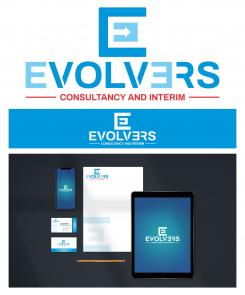
logo ini didesain sederhana.
memodifikasi font satu persatu sehingga menjadi sebuah logo yang terlihat berkelas dan mewah untuk dijadikan logo perusahaan.
dengan perpaduan warna hitam yang bermakna ketegasan dan kuat untuk terus berkembang dan maju. warna kuning bermakna semangat dan kehangatan untuk terus memberi yang terbaik untuk klien.
Please design a logo and corporate identity for a high end management services firm consultancy and Interim
- Contest holder: bepker
- Category: Logo & stationery
- Status: Ended
Start date: 21-09-2020
Ending date: 19-10-2020
It all started with an idea...
A short, interactive guide helped them discover their design style and clearly captured what they needed.
Brandsupply is a platform where creative professionals and businesses collaborate on unique projects and designs.
Clients looking for a new logo or brand identity describe what they need. Designers can then participate in the project via Brandsupply by submitting one or more designs. In the end, the client chooses the design they like best.
Costs vary depending on the type of project — from €169 for a business or project name to €539 for a complete website. The client decides how much they want to pay for the entire project.
This logo is designed simply.
This logo consists of a circle that symbolizes the change towards a global company that makes it one of the best performing companies in its field.
The letter E in the shape of an arrow pointing upwards symbolizes change to keep going and moving forward to achieve success.
with a gold color combination on the company logo which gives a luxurious and successful impression.
The evolvers logo is made with a very simple concept, easy to apply in all print and digital media.
there is a negative space of the letter E with a combination of red and yellow like the sunshine that continues to enlighten the company to continue to progress and develop.
 Nederland
 België
 France
 Deutschland
 Österreich
 International
