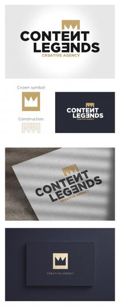
The first thing we can notice in the task of making a logo is. There is 14 characters in the name, and another 14 characters in the tagline plus the crown symbol - a lot of elements.
In that way, I made simply, minimalist and trendy design. Simply logo with clean lines, and there is no need to add ornate crown elements.
"less is more”
Gotham font is a great choice, simple, dynamic and symmetrical font.
In that way and style and crown is made from Gotham font, from two letters N in the mirror.
At the end We got one symmetrical, minimalist, symmetry and easy to remember logo, with strong association of creativity by turning the same letters in the mirror.
In addition I made crown symbol, which can be used independently on various promotional materials.
Rebranding logo and identity for Creative Agency Content Legends
- Contest holder: Rvogelaars
- Category: Logo & stationery
- Status: Ended
- Files: File 1
Start date: 30-06-2021
Ending date: 26-07-2021
It all started with an idea...
A short, interactive guide helped them discover their design style and clearly captured what they needed.
Brandsupply is a platform where creative professionals and businesses collaborate on unique projects and designs.
Clients looking for a new logo or brand identity describe what they need. Designers can then participate in the project via Brandsupply by submitting one or more designs. In the end, the client chooses the design they like best.
Costs vary depending on the type of project — from €169 for a business or project name to €539 for a complete website. The client decides how much they want to pay for the entire project.
 Nederland
 België
 France
 Deutschland
 Österreich
 International

