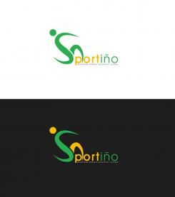
I captured the health and science aspects in my simplistic logo while maintaining professionalism. The heart represents health. The atom, the second "o" of the word Sportiño, assures that your research is backed up by scientific facts. The font can be changed, if wanted.
Sportiño - a modern sports science company, is looking for a new logo and corporate design. We look forward to your designs
- Contest holder: dennykrcmarek
- Category: Logo & stationery
- Status: Ended
- Files: File 1, File 2, File 3
Start date: 27-01-2017
Ending date: 03-02-2017
It all started with an idea...
A short, interactive guide helped them discover their design style and clearly captured what they needed.
Brandsupply is a platform where creative professionals and businesses collaborate on unique projects and designs.
Clients looking for a new logo or brand identity describe what they need. Designers can then participate in the project via Brandsupply by submitting one or more designs. In the end, the client chooses the design they like best.
Costs vary depending on the type of project — from €169 for a business or project name to €539 for a complete website. The client decides how much they want to pay for the entire project.
hi Dunja! thank you for the design. I like the heart instead of the O. But the heartrate in the heart is too much, maybe you can change it again a simple icon, where a child is doing sport. the second icon of the o on the end it too complicated. in overall i must say that i like simple logos and icons, thats too much complicated.
I captured the health and science aspects in my simplistic logo while maintaining professionalism. The heart represents health. The atom, the second "o" of the word Sportiño, assures that your research is backed up by scientific facts. The font can be changed, if wanted.
 Nederland
 België
 France
 Deutschland
 Österreich
 International


