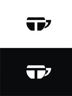
The Modern Tea Brand: minimalistic, modern, social tea brand

Start date: 01-05-2018

Ending date: 15-05-2018

Total budget: € 125.00
Latest design
Book cover
MilTod

It all started with an idea...

A short, interactive guide helped them discover their design style and clearly captured what they needed.

Needs


We would like to have a very minimalistic logo and house style to support our modern brand. Further personality traits we would like to express are Straightforward and Quality-oriented, but the minimalism might minimize those traits in the house style.

We named the brand “T”, the most minimalistic name we could come up with for a tea brand.

We would like you to design a logo and house-style for the tea brand.

Extra information:

Our brand values: Responsible, Down to earth, Transparent, Excellence, and Innovation.

In previous iterations we really liked just the letter “T” as the logo, with a rectangle and stripe around it to resemble a very minimalistic tea bag. We very much like this as a starting point, but if you have different ideas, we would love to see them.

I have a background as a branding strategist with some graphic design experience, and plan to give feedback on a daily basis.

Company description


We are starting a tea brand selling high quality, organically produced, hand-plucked, orthodox tea. Our tea is produced in Nepal, where we have connected with different small-scale tea farmers. We pay good prices for the tea they produce.

We are going with a modern brand as we believe that a modern brand should not only focus on high quality products, but also on ethically responsible business operations. Our tea is ‘real’, compared to many of the tea’s found in the Dutch supermarket. We are working on a promo video of the farmers plucking the tea and processing the tea further to show where our tea comes from.

We will have quite a wide assortment of tea types. We have our two ‘best’ types, which are not available all year through because of their exclusivity, called Golden Needles and Silver Needles.

Besides these, we have Black tea (golden tips), White tea, Premium Green tea, Pearl Green Tea, Green Oolong tea, Masala tea, Green Sencha tea, Bancha Green tea, Roasted Green Tea, Classic green tea, Autumn Black Tea, Himalayan Gold Tea, Himalayan Longyin Tea, Black Tea Delight.

Target group


Colors, favourites and other requirements


On our packaging we would like to show the type of the tea and year of plucking (different years have different qualities, like with wine). An idea that we liked from earlier explorations is to have a different color packaging for every type of tea.

We will be selling the tea in tin cans.

Designer: stevan banjac stevan banjac
logo-vizitkarte-memorandumi-dizajn-stevan-banjac-tS7aSRhg

No comments

This contest is finished. Its not possible to reply anymore.
logo-vizitkarte-memorandumi-dizajn-stevan-banjac-JBXgXxku

No comments

casparsmitscasparsmits

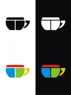
We really like how the T works with the teacup, but we need something more minimalistic and slick. I think it's mainly because of the shape of the teacup. Could you try to make it more minimalistic?

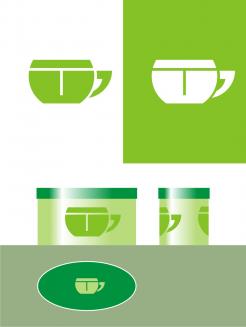
Also, could you put it on a packaging template like this one: https://free-psd-templates.com/free-tea-packaging-mock-up/ ?

Best,
Caspar

casparsmitscasparsmits

Oh, in the link I send you, I'm talking about the first template.

This contest is finished. Its not possible to reply anymore.
logo-vizitkarte-memorandumi-dizajn-stevan-banjac-rzXt9Mae

No comments

stevan banjacstevan banjac

thanks for your suggestion
Color combinations are possible as needed
greeting

casparsmitscasparsmits

Hi Stevan,

Would you be able to:
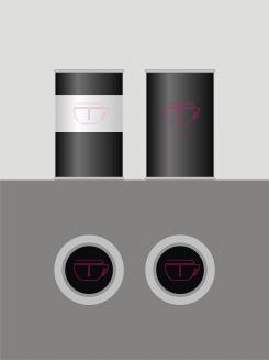
- put the design on a can?
- make the T stand out more (now it might be mistaken as just two lines; maybe they shouldn't end all the way through? I'm not sure)

We don't really like the different colors in the logo (also, the colors make me think of the old Windows logo :D). We would like to see different colors in the logo related to the can, though.

Best,
Caspar

This contest is finished. Its not possible to reply anymore.
logo_huisstijl-stevan-banjac-rVurberY

No comments

casparsmitscasparsmits

Hi Stevan,

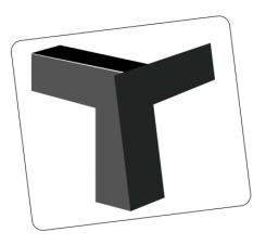
I like the idea behind it! But the shape of the T makes it feel a bit heavy or chuncky, and I'm not sure if the T stand out enough. Do you think you can find a way to make it stand out more, and make the T feel lighter?

This contest is finished. Its not possible to reply anymore.