How it looks now?
The Modern Tea Brand: minimalistic, modern, social tea brand
- Contest holder: casparsmits
- Category: Logo & stationery
- Status: Ended
Start date: 01-05-2018
Ending date: 15-05-2018
It all started with an idea...
A short, interactive guide helped them discover their design style and clearly captured what they needed.
Brandsupply is a platform where creative professionals and businesses collaborate on unique projects and designs.
Clients looking for a new logo or brand identity describe what they need. Designers can then participate in the project via Brandsupply by submitting one or more designs. In the end, the client chooses the design they like best.
Costs vary depending on the type of project — from €169 for a business or project name to €539 for a complete website. The client decides how much they want to pay for the entire project.
Hi M&I Design,
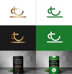
We've been discussing your design and like the T as a teacup, but don't find it modern enough, most likely due to the curves in the logo. Do you think it's possible to make the logo more modern?
For me, the line below the logo doesn't make the logo stand out more, I think we better stick to just the letter T.
I'm curious what you come up with!
Best,
Caspar
I work on it
This logo should represent the letter T in the form of cups, we can make examples of bags if you want
Hi M&I Design,
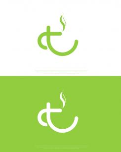
Thank you for your design! I really like some elements of the logo, mainly the tea cup. I'm curious if it's possible to remove the smoke signal and make the logo stand out a little more. Could you try that?
 Nederland
 België
 France
 Deutschland
 Österreich
 International


