No comments
The Modern Tea Brand: minimalistic, modern, social tea brand
- Contest holder: casparsmits
- Category: Logo & stationery
- Status: Ended
Start date: 01-05-2018
Ending date: 15-05-2018
It all started with an idea...
A short, interactive guide helped them discover their design style and clearly captured what they needed.
Brandsupply is a platform where creative professionals and businesses collaborate on unique projects and designs.
Clients looking for a new logo or brand identity describe what they need. Designers can then participate in the project via Brandsupply by submitting one or more designs. In the end, the client chooses the design they like best.
Costs vary depending on the type of project — from €169 for a business or project name to €539 for a complete website. The client decides how much they want to pay for the entire project.
No comments
Hi Lisa,
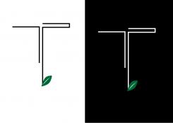
I think the right level of minimalism is achieved when you remove the tea leaf. Yet, then the symbolism of tea is missing again... Do you think you could find a way to get to our preferred level of minimalism while finding a symbol to include?
Best,
Caspar
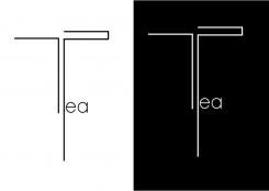
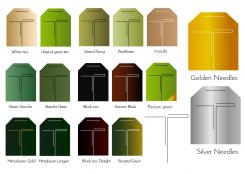
Hello, I did this, i simple writed "tea"
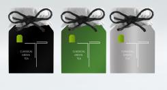
This is a presentation and proposition. For better quality, you can click on the picture.
I did'nt choose tin can because aluminium is bad for health and it could be not represent an ethical and responsible image. I hope this will correspond you,
I think you could be selling refills in cardboard or stainless steel boxes.
Lisa
No comments
Hello, this is different packaging
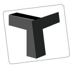
Hi Lisa, thanks for your submission! We like the minimalistic design. Could you also play around a bit with the "T", i.e. maybe use some thicker lines?
Hi Lisa, thanks for your submission! We like the minimalistic design. Could you also play around a bit with the "T", i.e. maybe use some thicker lines?
Hi Lisa, thanks for your submission! We like the minimalistic design. Could you also play around a bit with the "T", i.e. maybe use some thicker lines?
Hi Lisa, thanks for your submission! We like the minimalistic design. Could you also play around a bit with the "T", i.e. maybe use some thicker lines?
Hi Lisa, thanks for your submission! We like the minimalistic design. Could you also play around a bit with the "T", i.e. maybe use some thicker lines?
Hi Lisa, thanks for your submission! We like the minimalistic design. Could you also play around a bit with the "T", i.e. maybe use some thicker lines?
Hi Lisa, thanks for your submission! We like the minimalistic design. Could you also play around a bit with the "T", i.e. maybe use some thicker lines?
Hi Lisa, thanks for your submission! We like the minimalistic design. Could you also play around a bit with the "T", i.e. maybe use some thicker lines?
 Nederland
 België
 France
 Deutschland
 Österreich
 International
