Design a stylish label for a new beer brand

Start date: 01-04-2021

Ending date: 18-04-2021

Total budget: € 479.00
Latest design
Book cover
1tita

It all started with an idea...

A short, interactive guide helped them discover their design style and clearly captured what they needed.

Needs


Design a label for a new Belgian blond beer. The label is important to immediately add character to this new beer brand, because it stands out and catches the eye of the people in a stylish way.

The name is ofcourse important. The name of the beer is "Blonde Milf". Most people are aware of what milf means, for those who are not: a milf can be briefly described as a woman who looks very attractive. The vibe of an attractive, sensual woman may be present on the label, but in a mysterious and stylish way. A vague silhouette can be an idea, see photo 'silhouette' in attachment. Specifically with this vague silhouette, could it be an idea to make it look like she finds herself inside the bottle?
But of course we let you, designers, do your own thing with the label.


Specifics of the bottle and the size of the label:
- Bottle is brown glass, 330ml, for an idea of the shape of the bottle, see photo bottle.
- Label height: 80mm
- Label width: to be determined by yourself within the design, but take into account the diameter of the bottle is 61mm (maximum label width = 175mm)

Characteristics of the beer:
- Blond, alc. 7.5% Vol.
- Refermentation in the bottle
- Contains Barley Malt, Wheat


What are legal obligations that must be on the label:
● Belgian Beer; or beer and somewhere mention product or Belgium --> “Blond Belgisch Bier”
● Ingredients: allergens such as wheat (malt) and barley (malt) --> Contains BARLEY MALT AND WHEAT
● Content --> 330ml Ҽ
● Best before --> Best before: + white/black box provided for the date
● Name and address: Jacoba Trading bvba
Turnhoutsebaan 49
3290 Diest, Belgium
● X% vol --> 7.5% Vol.
● Refermentation in the bottle --> Refermentation in the bottle
● No deposit (no empty goods deposit) (may be displayed by logo) --> preferably the Logo
● Not suitable for pregnant women (may be represented by logo) --> preferably the Logo
Other provisions:
● Font size must be at least 1.2mm
● the name, the net quantity and the alc.% must be in 1 field of vision


Colors:
The label is not intended to be some sort of comic or cartoon with 20 bright colors. The intention is rather to create a sober, mysterious and stylish feeling. Colors that in our opinion (in addition to black-white-gray) can certainly be options: red, gold.
But again: We leave you as a designer the freedom for creativity with colors.


Please leave room on the label for some additions:

1. A white/black space of 15mm by 15mm in the lower right corner of the label for a black and white logo of the brewery. This logo will be delivered to the winner afterwards for completion. (fyi, this ‘external’ brewery has no link with our new beer brand, so how the logo of the brewery looks like is not relevant)

2. Somewhere on the label an icon for a facebook page + the name of the facebook page (this name will be sent to the winner afterwards for completion).

3. Some legally required statements will have to be translated afterwards into FR + EN. This will be coordinated with the winner for completion.


Afterwards, the winner can also carry out new assignments regarding this new beer brand, such as a beer glass design, design beer mats, etc.

Company description


Target group


Colors, favourites and other requirements


Designer: EF grafik EF grafik
autre_design-filoche-eric-0d2sqnKa

EF grafikEF grafik

Hello,

Here is a first approach for your project.

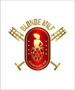
The idea is to take the woman's shadow and blend it into the glass like a shower glass. This label is to be completed with your missing items.

Finished format: 80 X 80

Thank you for your comeback.

Eric

PS: do you speak french?

Jacoba-TradingJacoba-Trading

Hi Eric,
I do speak French but expressing is easier for me in English. Hope it is fine.
Thanks for your first idea.
Personally i think it would be better to blend the woman's shadow in the bottle, as the label is on the bottle. The form of the glass will be kind of a 'Karmeliet' glass, so that's a second reason it doesn't really suit me. But thanks for making another design, I look forward to it!
Jan

EF grafikEF grafik

Hello Jan,

Thank you for your comeback.

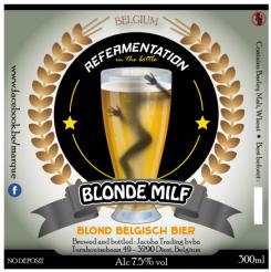
I understand your request but having only had two stars, I think I do not meet your expectations even with a new graphic.

Good choice

Eric

This contest is finished. Its not possible to reply anymore.