The concept of Metal & Glass,
A matte black core surrounded by a shell of clear glass.
An exciting merge of two materials that wil catch the eye.
The black aluminum bottle that holds the secret of the Three Friends.
Together with the clear glass that represents the vodka.
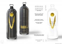
From the top we start with a pitch black metal screw cap, possibly a little shiny. But a solid statement it should be.
When we slide down over the clear glass shell we come across a minimalistic designed gold coin.
On the coin we see two signature elements. First a V shape combined with three dots… this is the 'Three Friends V Logo'.
The dots represent the Three Friends who’s story is so connected to V for Victory. I recommend the friends to use the ••• as a signature for any product they launch.
The second element on the coin is a floral design of wheat. This may change if it turns out the vodka is made of potato rather then wheat.
When we travel down to the middle section of the bottle we see a combination of layered design elements.
Some are on the glass, some are behind the glass on the matt black aluminum bottle. This depth will ad to the exclusive look & feel of the vodka.
The deepest element is an organic golden V. Above it, on top of the glass (written in the same pitch black color as the screw cap) we see the second part of the logo: for victory.
Finally we end the middle section with a short explanation of the content of the bottle. Premium Dutch Vodka.
The last element on the front side of the bottle is the Three Friends Signature. Three small golden dots.
If you would turn the bottle to the back side now, you will see that the signature is aligned and repeated a second time there.
Only accompanied by a small golden statement: V for Victory, Premium Dutch Vodka by Three Friends.
By now you may have spotted the two different writing formats of the brand.
Whenever we write V for Victory in one line, both the first and the second V are capital.
However, when we use them underneath each other (as seen on the bottle) only the first V is capital!!
In a pyramide formation the second V should be in small writing for better balance and harmony.
On the backside of the bottle there is room for a golden barcode and some additional signage.
Aswel as the Thee Friends Story and the pyramid formation of the brandname.
On the back the bottom of the top most V is aligned with the bottom of the V on the coin.
All of the text on the back is placed on the matte black aluminum bottle.
My first idea was to have the bottle be 30cm in hight (10cm for each friend) and all of the different measurements and sizes be equally divided by three.
In the concept I've changed this after a quick comparison with other bottles.
However! If possible I would still recommend investigating this option, since it makes for a very good additional story.
The concept of Metal & Glass
by Jos Leene a.k.a. Zadique.
Design an authentic, iconic, desirable and high-end bottle for our Vodka brand.
Start date: 02-08-2015
Ending date: 02-09-2015
It all started with an idea...
A short, interactive guide helped them discover their design style and clearly captured what they needed.
Brandsupply is a platform where creative professionals and businesses collaborate on unique projects and designs.
Clients looking for a new logo or brand identity describe what they need. Designers can then participate in the project via Brandsupply by submitting one or more designs. In the end, the client chooses the design they like best.
Costs vary depending on the type of project — from €169 for a business or project name to €539 for a complete website. The client decides how much they want to pay for the entire project.
 Nederland
 België
 France
 Deutschland
 Österreich
 International

