 Nederland
 België
 France
 Deutschland
 Österreich
 International
No comments
It all started with an idea...
A short, interactive guide helped them discover their design style and clearly captured what they needed.
Brandsupply is a platform where creative professionals and businesses collaborate on unique projects and designs.
Clients looking for a new logo or brand identity describe what they need. Designers can then participate in the project via Brandsupply by submitting one or more designs. In the end, the client chooses the design they like best.
Costs vary depending on the type of project — from €169 for a business or project name to €539 for a complete website. The client decides how much they want to pay for the entire project.
Designer:
 villego
This contest is finished. Its not possible to reply anymore.
No comments
This contest is finished. Its not possible to reply anymore.
No comments
This contest is finished. Its not possible to reply anymore.
No comments
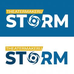
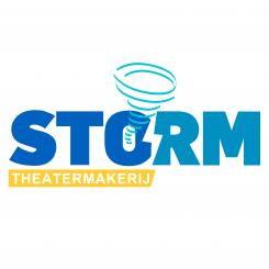
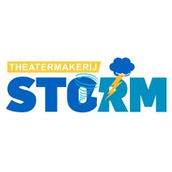
Hoi, fijn dat je dit logo hebt aangehouden. In het ontwerp zoals hij nu is, wordt het te druk. Ik hou van strak. Ik vind de wervelwind zoals in je eerste ontwerp het mooiste. Zou je: - De kleurcodes kunnen aanhouden zoals in mijn beschrijving staat? - Kan je doorgaan op de wervelwind en hier een giften van maken? Het mag meer abstrtact. - In het logo staat nu in het wit tussen de O en de R al een lege ruimte voor een bliksemschicht. Zou je de bliksem kunnen laten knipperen in de geelkleur, waarna de O verandert in de wervelwind. Kan deze de letters omver waaien (misschien juist alleen de letters van STO of RM)? Ik hoop dat je je er ideeën van krijgt. Ik weet niet zeker of je gif ook kunt laten zien hier. Je mag het ook mailen naar Niels@theatermakerijstorm.nl Al vast bedankt
This contest is finished. Its not possible to reply anymore.
No comments
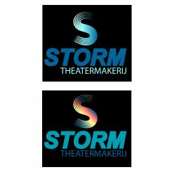
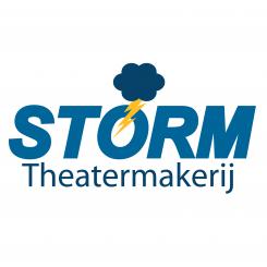
Leuk idee met die wolk. Kan jij mijn huidige logo helemaal in tact maken, waarbij de wolk richting de O en de R waait en daar de bliksemschicht laat gaan? Als je er een gif van kan maken zou super zijn.
This contest is finished. Its not possible to reply anymore.
No comments
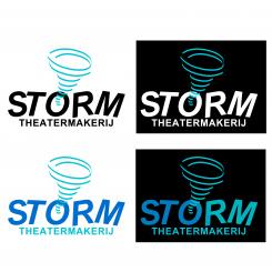
Kan je mijn oude logo in tact laten. Deze vind ik strakker en zakelijker.
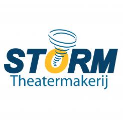
Is het mogelijk de wervelwind de letter O te laten zijn? Dan begint het gifje met de O deze waait naar de wervelwind en waait weg uit het logo -> waait weer terug in het logo en wordt weer de O...
Kan je mijn oude logo in tact laten. Deze vind ik strakker en zakelijker.
Is het mogelijk de wervelwind de letter O te laten zijn? Dan begint het gifje met de O deze waait naar de wervelwind en waait weg uit het logo -> waait weer terug in het logo en wordt weer de O...
This contest is finished. Its not possible to reply anymore.