Nederland
 België
 France
 Deutschland
 Österreich
 International
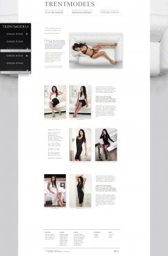
1. This type of navigation is not user friendly. I'm working on interfaces for smartphones and tablets. Today they are many screen size and you web site may be viewed on all of them. In the professional world we call that responsive ( or adaptive ) design.
2. Users have the habit of an horizontal navigation bar. Put it to the left destabalizes them.
3. You also need to prioritize elements ( Entgelte is a sub-heading of Honorare ). If you simplify the title track, the user can quickly find what he search.
4. I therefore propose this solution: Typo in the title color, easy to make it readable on a small screen. Hover drop down menu for sub-headings and color change, and onClick display pages.
Einfach und effektiv.
Kommentare willkommen.
Herzlich
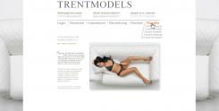
Design of a Navigation
- Contest holder: martinbrent
- Category: Other
- Status: Ended
- Files: File 1, File 2, File 3
Start date: 18-11-2012
Ending date: 02-12-2012
It all started with an idea...
A short, interactive guide helped them discover their design style and clearly captured what they needed.
Brandsupply is a platform where creative professionals and businesses collaborate on unique projects and designs.
Clients looking for a new logo or brand identity describe what they need. Designers can then participate in the project via Brandsupply by submitting one or more designs. In the end, the client chooses the design they like best.
Costs vary depending on the type of project — from €169 for a business or project name to €539 for a complete website. The client decides how much they want to pay for the entire project.