 Nederland
 België
 France
 Deutschland
 Österreich
 International
van 16
Design the new van for a sustainable energy company
Start date: 11-06-2021
Ending date: 28-07-2021
Total budget: € 519.00
Latest design
It all started with an idea...
A short, interactive guide helped them discover their design style and clearly captured what they needed.
Brandsupply is a platform where creative professionals and businesses collaborate on unique projects and designs.
Clients looking for a new logo or brand identity describe what they need. Designers can then participate in the project via Brandsupply by submitting one or more designs. In the end, the client chooses the design they like best.
Costs vary depending on the type of project — from €169 for a business or project name to €539 for a complete website. The client decides how much they want to pay for the entire project.
Designer:
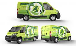
 hologram
This contest is finished. Its not possible to reply anymore.
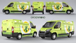
VAN - 14
This contest is finished. Its not possible to reply anymore.
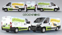
VAN-13
This contest is finished. Its not possible to reply anymore.
van-12
This contest is finished. Its not possible to reply anymore.
van-11
This contest is finished. Its not possible to reply anymore.
van-10
This contest is finished. Its not possible to reply anymore.
van-9
(Warning. I don't think the mock-up was done the most precisely, especially the back of the Van)
This contest is finished. Its not possible to reply anymore.
van_7
This contest is finished. Its not possible to reply anymore.
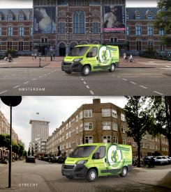
streets
This contest is finished. Its not possible to reply anymore.
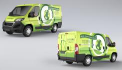
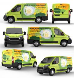
proposal_6
Better, thank you. Perhaps you could use the buildings from our illustration file and put them on the planet? Just an idea :)
This contest is finished. Its not possible to reply anymore.
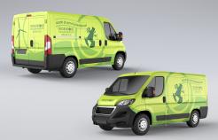
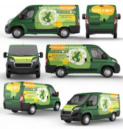
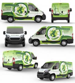
proposal_5
There's not enough contrast in the colors, making the whole design look kind of bland.
Thanks for the constructive suggestion.
This contest is finished. Its not possible to reply anymore.
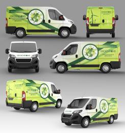
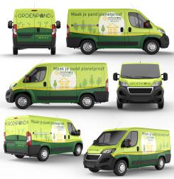
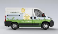
VAN PROPOSAL # 3
Interesting design. I think the planet would look better in the center of the circles. The design on the back side is still a little too wobbly. Try to be mindful of the doors, some text is cut off.
Yes, you are right. I thought that the competition was over, so the mistake with the text was made in a hurry.
We extended the duration of the competition because we changed a few things in the briefing.
This contest is finished. Its not possible to reply anymore.
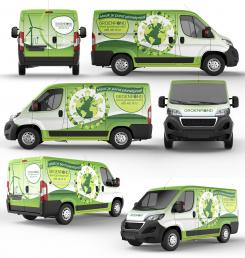
No comments
Everything seems a little wobbly.
This contest is finished. Its not possible to reply anymore.
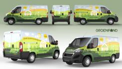
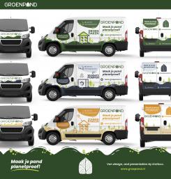
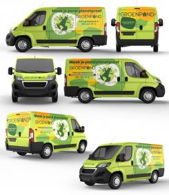
GROENPAND - 2
Very cheerful design! Definitely says 'inspired by nature' :-). There's a lot going on, perhaps even too much. The house illustrations with the white background look a little off. But overall we do like the layered design.
This contest is finished. Its not possible to reply anymore.
No comments
This contest is finished. Its not possible to reply anymore.