 Nederland
 België
 France
 Deutschland
 Österreich
 International
No comments
Design the new van for a sustainable energy company
Start date: 11-06-2021
Ending date: 28-07-2021
Total budget: € 519.00
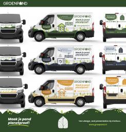
Latest design
It all started with an idea...
A short, interactive guide helped them discover their design style and clearly captured what they needed.
Brandsupply is a platform where creative professionals and businesses collaborate on unique projects and designs.
Clients looking for a new logo or brand identity describe what they need. Designers can then participate in the project via Brandsupply by submitting one or more designs. In the end, the client chooses the design they like best.
Costs vary depending on the type of project — from €169 for a business or project name to €539 for a complete website. The client decides how much they want to pay for the entire project.
Designer:
 dadan
dadan
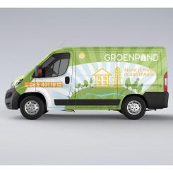
We liked the version without the green top better. Sometimes less is more!
This contest is finished. Its not possible to reply anymore.

No comments
Not a big fan of the hand, sorry.
This contest is finished. Its not possible to reply anymore.
No comments
Better, thank you! :)
This contest is finished. Its not possible to reply anymore.
No comments
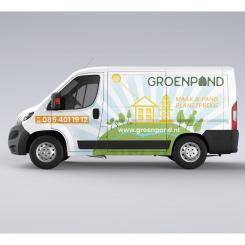
De blauwe lucht is absoluut beter. De lettergrootte en kleur van 'planetproof' en 'groenpand' zit wat te dicht bij elkaar, waardoor het onduidelijk is welk woord het logo is.
The blue sky is definitely better. The font size and color of 'planetproof' and 'groenpand' is a little too similar, making it unclear which word is the logo.
This contest is finished. Its not possible to reply anymore.
No comments
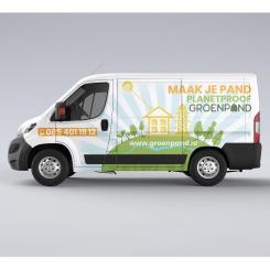
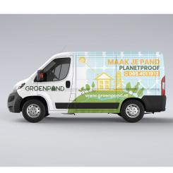
Het idee van de kleine planeet met een groenpand huisje erop is leuk! Het gebruik van de kleur lichtblauw is ook een aangename verrassing. We zijn echter niet zo'n fan van het gebruik van het bladhuisje als patroon hiervoor. Het logo komt waarschijnlijk ook beter tot zijn recht als het een centralere plek inneemt op de zijkant.
The idea of a small planet with a groenpand house on it is nice! The use of the light blue color is also a pleasant surprise. We're not a big fan of the use of the leaf-shaped house as a pattern though. The logo would probably be better placed in a more central position on the side.
This contest is finished. Its not possible to reply anymore.