 Nederland
 België
 France
 Deutschland
 Österreich
 International
How about this brother?
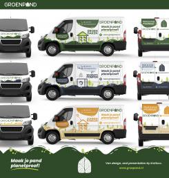
Design the new van for a sustainable energy company
Start date: 11-06-2021
Ending date: 28-07-2021
Total budget: € 519.00
Latest design
It all started with an idea...
A short, interactive guide helped them discover their design style and clearly captured what they needed.
Brandsupply is a platform where creative professionals and businesses collaborate on unique projects and designs.
Clients looking for a new logo or brand identity describe what they need. Designers can then participate in the project via Brandsupply by submitting one or more designs. In the end, the client chooses the design they like best.
Costs vary depending on the type of project — from €169 for a business or project name to €539 for a complete website. The client decides how much they want to pay for the entire project.
Designer:
 Mayesha Nugraha
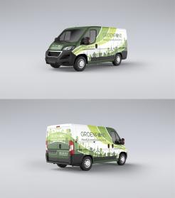
Yes! Better :)
Thankyou. some day we hope can design your car :)
This contest is finished. Its not possible to reply anymore.
No comments
Very cool design, much better than previous ones. Thank you!
Hi Groenpand Team.
I am very enthusiastic about your contest. can you give any suggestions so that this design will not only be cool, but be perfect!
Kind Regards,
Mayesha
Hmm, tough question! You could try to reduce the white outline effects. Although that might mean you have to edit some of the colors or the design to ensure there's still enough contrast and the readability doesn't suffer.
I will do it!
What I have to reduce is the white line effect
on the text, or on the car body?
Preferably the text wouldn't have an outline at all. If it helps you can invert the logo to white (on the front of the van for example).
This contest is finished. Its not possible to reply anymore.
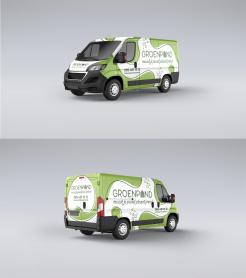
How about this?
This contest is finished. Its not possible to reply anymore.
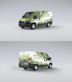
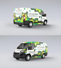
Organic Van Design. How about this?
Definitely an improvement on the last one in terms of design, but it doesn't really feel like it has anything to do with making residential/office buildings more sustainable. It could just as well be a soda company (due to the bubbles).
This contest is finished. Its not possible to reply anymore.
Hi Groenpand Team.
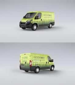
My name is Mayesha, how about this design? please give me feedback. Thanks
Regard,
Mayesha
I'm definitely getting the "organic" vibe, but perhaps you went a little overboard with the shapes. Sometimes less is more. Some of the colors are a little too saturated (almost neon-like) as well.
This contest is finished. Its not possible to reply anymore.