 Nederland
 België
 France
 Deutschland
 Österreich
 International
No comments
Design the new van for a sustainable energy company
Start date: 11-06-2021
Ending date: 28-07-2021
Total budget: € 519.00
Latest design
It all started with an idea...
A short, interactive guide helped them discover their design style and clearly captured what they needed.
Brandsupply is a platform where creative professionals and businesses collaborate on unique projects and designs.
Clients looking for a new logo or brand identity describe what they need. Designers can then participate in the project via Brandsupply by submitting one or more designs. In the end, the client chooses the design they like best.
Costs vary depending on the type of project — from €169 for a business or project name to €539 for a complete website. The client decides how much they want to pay for the entire project.
Designer:
 babulhossain
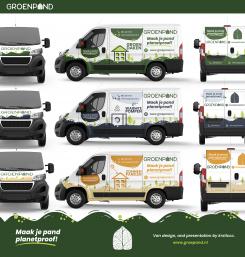
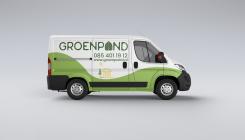
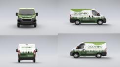
Very nice! Good use of the green shapes and nice hierarchy between the various elements.
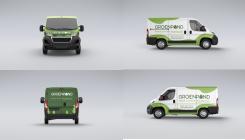
thank you,, if need any changes let me know, also if you choose me as a winner,, i will handover you all editable print ready file..
This contest is finished. Its not possible to reply anymore.
No comments
This contest is finished. Its not possible to reply anymore.
No comments
This contest is finished. Its not possible to reply anymore.
No comments
We're not a fan of the straight lines, it doesn't fit our brand.
This contest is finished. Its not possible to reply anymore.
No comments
This contest is finished. Its not possible to reply anymore.
No comments
This contest is finished. Its not possible to reply anymore.
No comments
Slogan is missing.
This contest is finished. Its not possible to reply anymore.
No comments
This contest is finished. Its not possible to reply anymore.
No comments
The design is very similar to that of Blonde_Draak.
This contest is finished. Its not possible to reply anymore.
No comments
This contest is finished. Its not possible to reply anymore.
No comments
This contest is finished. Its not possible to reply anymore.
No comments
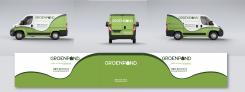
The grass unfortunately doesn't help with the association of a gardening company.
This contest is finished. Its not possible to reply anymore.
No comments
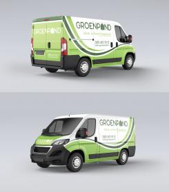
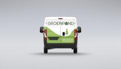
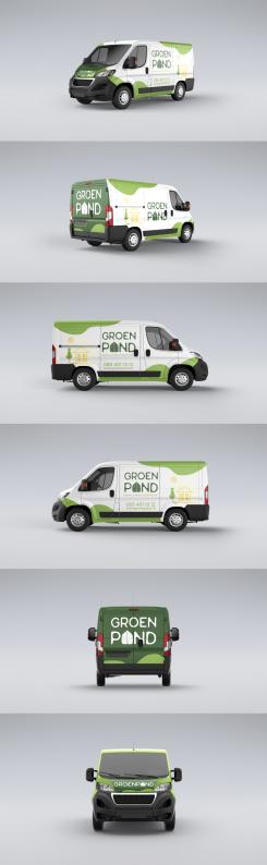
The trees on the back are cut off and the shapes on the front look a little strange. It's not really clear what they are. The design on the side looks nice and clean though. However I feel like the design overall doesn't really communicate what our company does. It could just as well be a van for a gardening company.
This contest is finished. Its not possible to reply anymore.
No comments
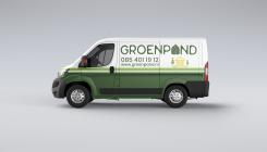
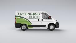
hello sir,, see o make very clean and simple design,, and see it look creative,, let me know if there need any changes,, also feedback please,, your feedback help me to improve it
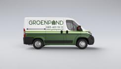
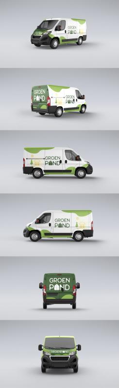
Thank you for your design! I can see it includes all of the elements we've asked for.
As for feedback, I like the green shapes around the edges of the van. They flow nicely. Nice use of the different shades of green.
We'd prefer it though if the company name wasn't split into two lines. It's one word, not two. The added illustration is nice, but it only covers one of our services (installment of solar panels). I think it would be better to either leave it out, or include illustrations of our other services as well (though they'd have to be much smaller of course).
thanks for your valuable feedback,,, i am working on it and trying update,,,,
This contest is finished. Its not possible to reply anymore.
No comments
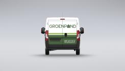
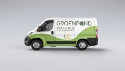
sorry,, i forget to use phone and web address
Thanks for adding them in your other design!
This contest is finished. Its not possible to reply anymore.