 Nederland
 België
 France
 Deutschland
 Österreich
 International
No comments
New grafic design homepage www.rentair.be
- Contest holder: Rentair
- Category: Webpage design
- Status: Ended
Start date: 01-04-2014
Ending date: 17-04-2014
Total budget: € 499.00
Latest design
It all started with an idea...
A short, interactive guide helped them discover their design style and clearly captured what they needed.
Brandsupply is a platform where creative professionals and businesses collaborate on unique projects and designs.
Clients looking for a new logo or brand identity describe what they need. Designers can then participate in the project via Brandsupply by submitting one or more designs. In the end, the client chooses the design they like best.
Costs vary depending on the type of project — from €169 for a business or project name to €539 for a complete website. The client decides how much they want to pay for the entire project.
Designer:
 marioline
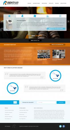
Bij deze versie is het de bedoeling dat de achtergrond foto van de header "fixed" is, zodat je wanneer je scrolt het lijkt of de menubalk, logo etc er "los" van zijn (weet niet of dit een goede uitleg is, 't is maar een idee).
Ik hoor 't graag als je aan kunt geven welke kant ik op zou moeten met de stijl van de buttons en het linker menu (en overige op- en aanmerkingen).
mvg,
Marioline
This contest is finished. Its not possible to reply anymore.
No comments
Beste Frans,
Bedankt voor de uitgebreide feedback.
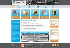
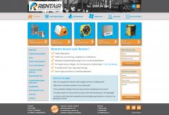
In mijn nieuwe ontwerp heb ik de layout aangehouden, maar geprobeerd meer "style" toe te voegen.
Voor wat betreft de klant referenties, dacht ik dat het een goed idee was om ook de oplossingen te tonen. Om niet in een lange lap tekst te verzenden heb ik nu 1 probleem + oplossing in een soort slider opgenomen (uiteraard is de bedoeling om per onderdeel een passende achtergrond foto te tonen).
Graag hoor ik wat je van dit nieuwe ontwerp vindt en wat je nog voor wijzigingen zou willen zien.
mvg,
Marioline
This contest is finished. Its not possible to reply anymore.
No comments
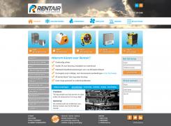
Dear Mariolinem I like the placement of the different items on the homepage and the visualization of the call to action buttons. However, for some reason I think this design is too simplistic, i.e. somewhat "childish". Please try to come up with a new design, but do not change the layout, which I really like. Try to bring in a more "professional" look for comparison. What would happen if you modify the call to action design, not in terms of colour but more the pure design?. Second remark: the items on the left side are somewhat "invisible" and do not catch the eye, pls try to modify these so they are more visible in terms of colour or design....Third remark..I really need to see the references more clearly...they need to catch the eye as well. Thanks for your new design. Your design is one of the three top contenders at the moment.
Frans
This contest is finished. Its not possible to reply anymore.