 Nederland
 België
 France
 Deutschland
 Österreich
 International
No comments
Adjust homepage (1 page) telecom website
- Contest holder: reynaerde
- Category: Webpage design
- Status: Ended
Start date: 17-06-2015
Ending date: 30-06-2015
Total budget: € 180.00
Latest design
It all started with an idea...
A short, interactive guide helped them discover their design style and clearly captured what they needed.
Brandsupply is a platform where creative professionals and businesses collaborate on unique projects and designs.
Clients looking for a new logo or brand identity describe what they need. Designers can then participate in the project via Brandsupply by submitting one or more designs. In the end, the client chooses the design they like best.
Costs vary depending on the type of project — from €169 for a business or project name to €539 for a complete website. The client decides how much they want to pay for the entire project.
Designer:
 graphix
This contest is finished. Its not possible to reply anymore.
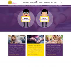
Bedankt voor je reactie! Ik heb nog 2 aangepaste versies gemaakt. Hoor graag wat je er zo van vindt!
Groetjes Sandra
This contest is finished. Its not possible to reply anymore.
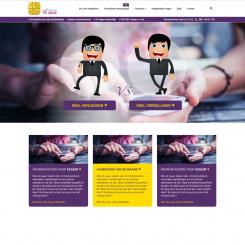
Ik geloof dat ik het iets verkeerd begrepen had ;-) Bijgevoegd de nieuwe versie, waarbij de oude site intact blijft. Ik ben benieuwd naar uw reactie!
Groetjes Sandra
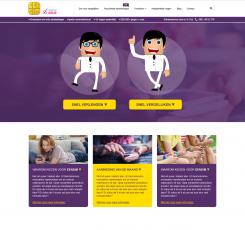
Hallo Sandra, inderdaad past dit beter bij de rest van de site.
Ik vind het alleen een beetje druk en het 'vs' vind ik niet zo goed bij de rest passen qua style.
Denk je dat je daar nog iets in aan kunt passen?
This contest is finished. Its not possible to reply anymore.
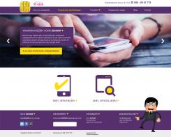
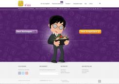
Beste reynaerde, bijgevoegd stuur ik je een eerste opzet voor de nieuwe homepage. Ik ben benieuwd naar je reactie!
Groetjes Sandra
This contest is finished. Its not possible to reply anymore.