 Nederland
 België
 France
 Deutschland
 Österreich
 International
Beste,
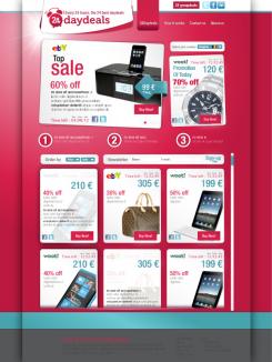
Hierbij nog een aanpassing, natuurlijk nog niet af.
Het is zuiver conceptioneel.
Het is het idee dat ik naar voren wil brengen.
mvg
pixol
Webdesign 24Daydeals.com
- Contest holder: 24Daydeals
- Category: Webpage design
- Status: Ended
- Files: File 1, File 2, File 3
Start date: 23-01-2012
Ending date: 23-02-2012
Total budget: € 250.00
Latest design
It all started with an idea...
A short, interactive guide helped them discover their design style and clearly captured what they needed.
Brandsupply is a platform where creative professionals and businesses collaborate on unique projects and designs.
Clients looking for a new logo or brand identity describe what they need. Designers can then participate in the project via Brandsupply by submitting one or more designs. In the end, the client chooses the design they like best.
Costs vary depending on the type of project — from €169 for a business or project name to €539 for a complete website. The client decides how much they want to pay for the entire project.
Designer:
 pixol
pixol
Beste Pixol,
Concept is duidelijk. Alhoewel ik de blauw-groene kleur niet zo vind. Ook mag de "featured deal" vervangen worden door 2 stukken:
1) Verwijzing naar 24Groupdeals
2) Facebook Like box met faces zonder stream (kopie andere site of gewoon tekstueel is voldoende)
We zien graag meer van je,
24Daydeals
This contest is finished. Its not possible to reply anymore.
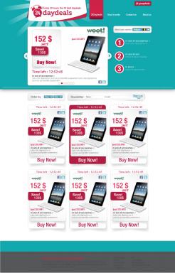
Beste,
Hierbij een aanpassing. Het is niet gemakkelijk om een goed ontwerp te vinden voor uw website. Ik probeer zo veel mogelijk de feedback van mij en andere ontwerpers te gebruiken.
Uw links naar website dat u graag ziet, heb ik proberen te visualiseren, met dit ontwerp. Ik hoor graag uw reactie.
mvg
Pixol
www.pixol.be
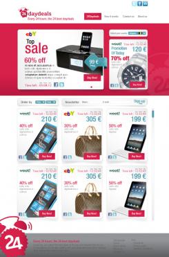
De footer daar moet ik nog over nadenken. :D
Maar ik had al willen weten of ik wel goed bezig ben.
Anders moet ik het over een andere boeg gooien.
mvg
pixol
www.pixol.be
Hoi Pixol,
Ja je zit op het goede spoor. Alleen is het geheel nu iets te roze ;-). Maar hier kan je zeker mee verder!
En voor de productboxen verwijs is je naar feedback van andere designers, dan komt dat wel goed
This contest is finished. Its not possible to reply anymore.
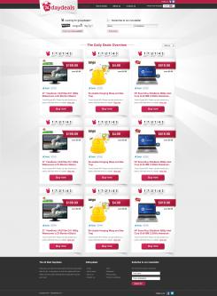
Beste,
Hierbij mijn ontwerp. hoop dat het u bevalt. Ik hoor graag reactie of feedback.
mvg
Pixol
www.pixol.be
Beste Pixol,
Ik zie veel van onze huidige site terugkomen, gewoon plain and simple. De footer en header mogen van mij anders, het middenstuk wat kleiner en er moet nog een subtiele knop geplaatst worden voor 24Groupdeals.
Verder zou ik meer dynamiek willen zien zonder dat het chaotisch of amateuristisch wordt. Sites als Dilter.com en Groupon.com laten goed zien wat ik precies bedoel.
We kijken uit naar verdere werken,
Mark
This contest is finished. Its not possible to reply anymore.