 Nederland
 België
 France
 Deutschland
 Österreich
 International
Hello
I present you a new creation totally different from the previous ones, I let you discover it.
You can see it real at this address:
http://www.cc-designweb.eu/project/
Best regard
Chantal C
Webdesign 24Daydeals.com
- Contest holder: 24Daydeals
- Category: Webpage design
- Status: Ended
- Files: File 1, File 2, File 3
Start date: 23-01-2012
Ending date: 23-02-2012
Total budget: € 250.00
Latest design
It all started with an idea...
A short, interactive guide helped them discover their design style and clearly captured what they needed.
Brandsupply is a platform where creative professionals and businesses collaborate on unique projects and designs.
Clients looking for a new logo or brand identity describe what they need. Designers can then participate in the project via Brandsupply by submitting one or more designs. In the end, the client chooses the design they like best.
Costs vary depending on the type of project — from €169 for a business or project name to €539 for a complete website. The client decides how much they want to pay for the entire project.
Designer:
 ccdesign
This contest is finished. Its not possible to reply anymore.
No comments
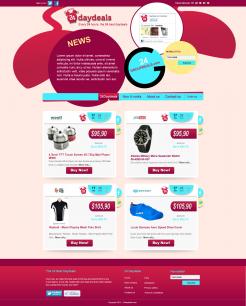
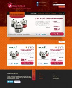
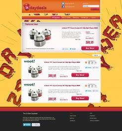
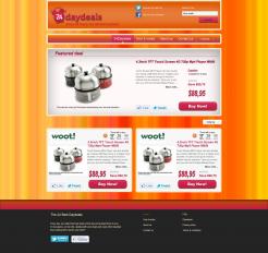
Thanks again for your designs! It's still not fresh and modern enough. That influences the complete picture. Hopefully you can do something with it, be free in your creativity and surprise us..
Mark
This contest is finished. Its not possible to reply anymore.
No comments
We also think the switch to 24Groupdeals is not obvious enough
This contest is finished. Its not possible to reply anymore.
No comments
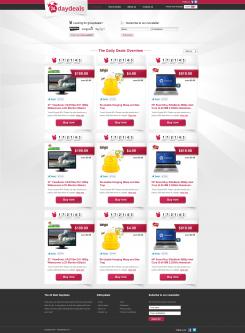
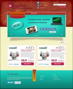
Thank you for your designs! We see you looked at Appsumo. However, the colors you use are not really fresh (lighter colors). Also I see you added a featured deal, but that's not necessary. That space we want to use for a promotional video, Facebook promotion and some kind of news stream.
Header is nice! But we still need a button or area that links to our other portal: 24groupdeals.
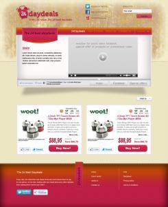
Hopefully you can do something with this feedback
This contest is finished. Its not possible to reply anymore.
No comments
With these boxes the site becomes longer, that's something we want to avoid
This contest is finished. Its not possible to reply anymore.
No comments
This contest is finished. Its not possible to reply anymore.