 Nederland
 België
 France
 Deutschland
 Österreich
 International
Mijn tweede versie.
Webdesign for online shop
- Contest holder: Tim89
- Category: Webpage design
- Status: Ended
Start date: 10-04-2017
Ending date: 07-05-2017
Total budget: € 399.00
Latest design
It all started with an idea...
A short, interactive guide helped them discover their design style and clearly captured what they needed.
Brandsupply is a platform where creative professionals and businesses collaborate on unique projects and designs.
Clients looking for a new logo or brand identity describe what they need. Designers can then participate in the project via Brandsupply by submitting one or more designs. In the end, the client chooses the design they like best.
Costs vary depending on the type of project — from €169 for a business or project name to €539 for a complete website. The client decides how much they want to pay for the entire project.
Designer:
 Lidewij
This contest is finished. Its not possible to reply anymore.

Goedenmorgen,
Allereerst bedankt voor de reactie, ik heb het meegenomen in het ontwerp. Ik heb twee versies gemaakt. Ik kijk uit naar jou reactie.
Fijne dag.
Met vriendelijke groet,
Lidewij Jansen
This contest is finished. Its not possible to reply anymore.
No comments
Erg netjes gedaan
Bedankt!
Hallo Lidewij,
Erg mooi geworden!
Nog paar kleine dingetjes.
1. De balk voor newsletter en social media, wil ik graag iets hoger hebben, zodat het wat meer uitspringt.
2. De social media buttons, de logo's van de social media in kleur blauw van mijn logo. Denk dat het dan mooier is en meer opvalt.
Verder ben ik zeer tevreden over jouw ontwerp!
Groeten Tim
This contest is finished. Its not possible to reply anymore.
Hey,
Aangepaste versie.
Gr,
Lidewij
This contest is finished. Its not possible to reply anymore.
Goedemorgen,
Hierbij mijn definitieve ontwerp, zie je reactie graag tegemoet.
Met vriendelijke groet,
Lidewij Jansen
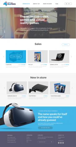
Goede avond Lidewij,
Ziet er uitstekend uit!
Nog wel een paar puntjes.
1. Hoofdmenu, hover over blauw springt nog niet uit. Bijv. dikker gedrukt text als mouse erover gaat.
2. Sales, hover over blauwe vak zit niet helemaal over grijze vak heen. Verder is ie top!
3. Footer, de text is niet overal hetzelfde. Partners deel kan weg trouwens. Daarin plaats kan een menu met: Playstation 4, Xbox One, PC, Switch, Accesoires etc etc.
4. Telefoonnummer hoeft voor mij niet wit te zijn, springt teveel uit en dat wil ik niet.
Ik kijk uit naar het volgende design van jou!
Groetjes,
Tim
This contest is finished. Its not possible to reply anymore.
Hallo Tim,
Ik heb de punten doorgevoerd. Wat betreft het design:
1.Design bestaat uit de call to action slider. Vandaar de 3 rondjes links.
2.Interactive gedeelte: hovers.
Hover menu items, kleur blauw overgenomen uit het logo.
Hover effecten hebben meerdere functies op de website en kan de koop ook laten toenemen, dit heb ik ook toegepast op de hover van sales, zoals je kunt zien krijg je een button te zien waar je op kunt klikken waardoor het item direct toegevoegd word aan de winkelmand.
Ik ben benieuwd wat je er van vind. Ik zou in de toekomst meer willen betekenen in dien mogelijk!
Fijne avond,
Met vriendelijke groet,
Lidewij Jansen
This contest is finished. Its not possible to reply anymore.
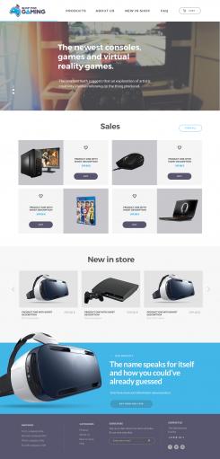
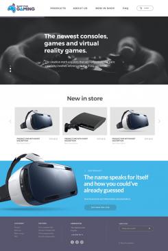
Hi,
Another version, colors background and buttons.
Best regards,
Lidewij Jansen
I hope u choose me!
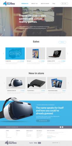
Hello Lidewij,
I will answer only on this design.
What i ment with point 2: 2: overlay button of the menu?
1. When i hover over a menu item i want to see different color or shape of the button i hover over.
2. Shopping cart, this button is futher from the right border then the Logo from left border if you know what i mean.
3. Sales, you have 8 tiles. Use all of those 8 tiles for different products. There are only 4 in this way.
4. Sales, change the products in the same way as how produtcts in 'New in store' look like. Pic. of products, text underneath and price on right of it.
5. Sales, the background color: grey in this example. Remove it, i don't like it. Use same transparent background as you use in 'New in store'.
6. New in store, the prices don't get my first attention, change them to the blue color.
7. The text in the bottom footer is not aligned. Fix that please. Keep same font and align to all categories of text in the footer.
Looking forward.
Kind regards,
Tim
This contest is finished. Its not possible to reply anymore.
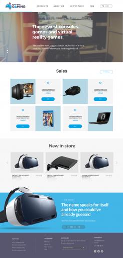
Hi,
With blue background sales-part.
Best regards,
Lidewij Jansen
I hope u choose me!
This contest is finished. Its not possible to reply anymore.
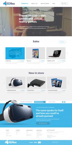
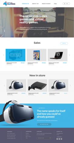
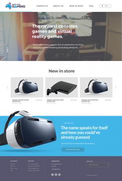
Hello tim!
Good to hear that you like my design and that it looks like what you had in mind.
I made the changes that you asked and I hope that this is what you want and make me the winner of the contest
The Changes I made:
1. Did the aligning.
2. I have added a new content to the page with Sales-items, there is a button right next to the title to go to a page with all sales. And 4 quick sales items. U can like the item, and also buy the item by clicking on the “buy button”.
3. Did some general changes in the footer.
I only had one question left: What do you mean with point 2: overlay button of the menu?
I hope to hear from you soon and that you like what I made for your webshop!
Kind regards,
Lidewij Jansen
https://www.linkedin.com/in/lidewij-j-119849b5/
I hope u choose me!
This contest is finished. Its not possible to reply anymore.
Hi,
Another design.
lidewij
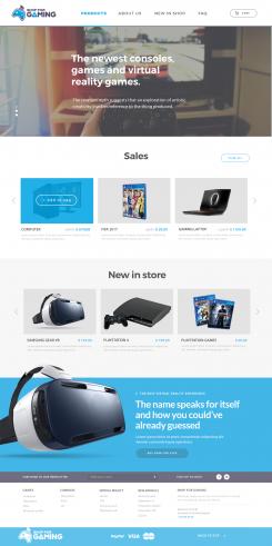
Hello Lidewij,
Thanks for your designs!
This looks really close to what i want.
Few things i want different:
1. The Cart button on top right corner is not correctly aligned from the border as the logo.
2. Can you show one overlay button of the menu in top header.
3. The content is good, i want an extra content named: Sales above 'New in store content'.
4. Bottom footer content, the subscribe and copyright to the far left and 'Categories' in middle, 'Contact us' to the right.
If you have any questions feel free to ask.
Looking forward! :)
Kind regards,
Tim
This contest is finished. Its not possible to reply anymore.
Hello,
Here my design, Hope u like it!
I really wanna win.
Lidewij
This contest is finished. Its not possible to reply anymore.
Hello again,
What do you think about my design?
Nice evening,
Lidewij
This contest is finished. Its not possible to reply anymore.
Hello,
Here my design for the front-page.
Best regards,
Lidewij
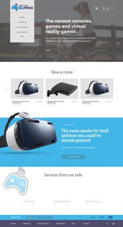
Hello,
Thanks for your design.
Couple of things to change.
1. The menu i want horizontal instead of vertical.
2. The banner is somewhat too big. The height of it can be smaller.
3. The order of content: Banner - Sales - New Products - Footer
4. Where you have the content "Services from our side" you can delete.
4. Where you have the content "Our product" you can delete.
All other things look good so far, i might come back later on those. First i want the main content to be done correct.
Looking forward to your next design!
This contest is finished. Its not possible to reply anymore.