 Nederland
 België
 France
 Deutschland
 Österreich
 International
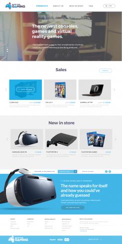
Hi Tim,
This is the updated design. I have changed the things you asked me:
"1. The logo i want futher to the left so that the menu comes more in the middle."
- I have placed the logo to the left, and centered the menu. This was what you meant?
"2. A shopping cart to the far right is what i miss in the top header."
- I have added a shopping cart to the far right. Also added a search icon.
"3. Can you align the social media button in bottom footer to the middle."
- Yes, I have done that.
"4. Missing a subscribe content. (email - newsletter - subscribe button)"
- Subscribe content is now in the footer of the webpage. Is this how you want it?
Hope to hear from you.
Kind Regards,
Jev
Webdesign for online shop
- Contest holder: Tim89
- Category: Webpage design
- Status: Ended
Start date: 10-04-2017
Ending date: 07-05-2017
Total budget: € 399.00
Latest design
It all started with an idea...
A short, interactive guide helped them discover their design style and clearly captured what they needed.
Brandsupply is a platform where creative professionals and businesses collaborate on unique projects and designs.
Clients looking for a new logo or brand identity describe what they need. Designers can then participate in the project via Brandsupply by submitting one or more designs. In the end, the client chooses the design they like best.
Costs vary depending on the type of project — from €169 for a business or project name to €539 for a complete website. The client decides how much they want to pay for the entire project.
Designer:
 gnl6331
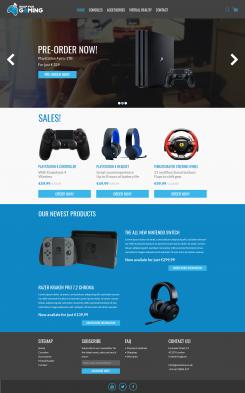
Hello Jev,
Looks good.
1. This is what i meant indeed, thanks.
4. This is how i want it yes, except the content text is not aligned. Keep the same space between all content text.
- I prefer the social media buttons somewhere else instead of the far bottom footer.
- New Products, i prefer to have it a white background instead of blue.
- Also i want the item with there text smaller, to make place for another 2 products.
- Same for 'Sales' products, also 4 products and smaller then they are now.
Looking forward!
Kind regards,
Tim
Hi Tim,
Many thanks for the compliment.
Also thanks for the feedback. I'm going to process it and make the design more perfect for you.
Kind Regards,
Jev
This contest is finished. Its not possible to reply anymore.
Hi Tim,
I made a very simple and basic design for your online shop. Please feel free to reply/give feedback.
Regards,
Jev
Hello Jev,
Thanks for your design!
1. The logo i want futher to the left so that the menu comes more in the middle.
2. A shopping cart to the far right is what i miss in the top header.
3. Can you align the social media button in bottom footer to the middle.
4. Missing a subscribe content. (email - newsletter - subscribe button)
Looking forward to your design!
Kind regards,
Tim
Hi Tim,
Thanks for the feedback. Im going to do the changes in the early tommorrow morning.
1. The logo - Going to put it further to the left and try to center the menu more as you want.
2. Shopping cart - Going to add that aswel.
3. Social media - Of course I can.
4. Subscribe content - Going to find a sollution for that. Will be addes.
Send the design tommorrow morning.
Kind Regards,
Jev
Ps. I also speak dutch.
This contest is finished. Its not possible to reply anymore.