 Nederland
 België
 France
 Deutschland
 Österreich
 International
No comments
Auction-Experts FDR-auctions
- Contest holder: DATASMIT
- Category: Website design
- Status: Ended
- Files: File 1, File 2, File 3
Start date: 21-12-2012
Ending date: 20-01-2013
Total budget: € 799.00
Latest design
It all started with an idea...
A short, interactive guide helped them discover their design style and clearly captured what they needed.
Brandsupply is a platform where creative professionals and businesses collaborate on unique projects and designs.
Clients looking for a new logo or brand identity describe what they need. Designers can then participate in the project via Brandsupply by submitting one or more designs. In the end, the client chooses the design they like best.
Costs vary depending on the type of project — from €169 for a business or project name to €539 for a complete website. The client decides how much they want to pay for the entire project.
Designer:
 giofa87
Looks good I like the icons and the look and feel
This contest is finished. Its not possible to reply anymore.
No comments
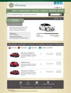
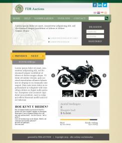
What is the difference between the pages? the icon on the top right corner?
I changed the footer and some graphic details.
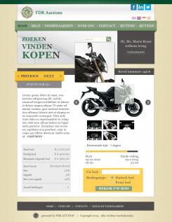
The first icon is for "KAVEL Volgen" the second indicates the ability to print the auction
This contest is finished. Its not possible to reply anymore.
No comments
Looks good I still miss the third page the page with the information about the auction and the list of categories.
right,
You could show me an example on this page?
About how you want it. because I was not clear from the document brief.
Thank you very much!
This contest is finished. Its not possible to reply anymore.
No comments
I like the design an I like the way you ues the the header. But I feel it is to much space waisted with not very relevant information can you loose the zoeke, vinden kopen and the black welcome?
We used it in SIlkroad with a specific meaning, which is not relevant here.
In the botom it will show powered by Auction-Experts
This contest is finished. Its not possible to reply anymore.
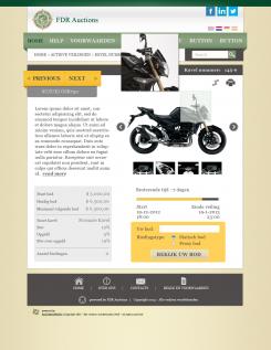
I made the required changes.
ps. I added a ribbon to be able to select any lot on offer. (optional)
Thank you the update, I like the idea for an extra attention on a certain auction.
We have here a business to business auction where machines, bankrupt companies, used cars etc will be sold. So the ribbon as a symbol has no use. Can place a more fitting symbol?
in particular, what message you want to communicate with this symbol?
(some possibilities are: new auction, auction expensive, etc)
Please understand that an auction can have a number of lots, some auctions have thousands of of lots. So the ribbon can say something about a an auction nothing about a lot (like the motorcycle).
This contest is finished. Its not possible to reply anymore.
No comments
Ziet er goed uit, naast de opmerkingen over de startpagina mis ik hier ook nog een aantal elementen die verplicht zijn, zie de briefing en ook demo.auction-experts.
Zonder deze elementen is de pagina niet te gebruiken.
This contest is finished. Its not possible to reply anymore.
Hi,
Ik leg deze miniatuurafbeeldingen van uw verzoek, om te begrijpen als dit ontwerp is als u wilt.
Voor het gemak zal alleen aan het PSD-bestand te beëindigen, zodat u gemakkelijk kunt efentualmente corrigeren.
Groeten.
Ziet er goed uit, ik zie dat je de voorbeeld ontwerpen goed bekeken hebt.
Ik heb de volgende opmerkingen:
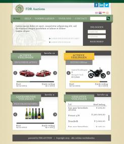
Het login veld met het grafische element links neemt veel ruimte in. Wat wil je aan teksten er in zetten?
Voor de voorpagina zou dat kunnen niet voor de andere pagina's.
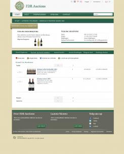
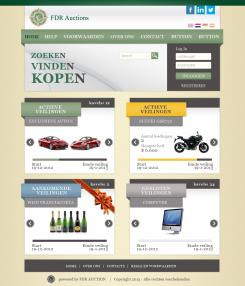
Is het de bedoeling dat per veiling de actieve kavels worden getoond?
Waarom is er verschil tussen de twee kleuren in de achtergrond van de actieve veilingen?
Het is niet meteen duidelijk wat het verschil is tussen een actieve veiling en een aankomende veiling. Kan dat door beter kleur gebruik?
De gesloten veiling begrijp ik niet ik zie hier een kavel lijst.
Ik mis nog een aantal zaken:
De navigatie boven heeft weinig ruimte voor extra knoppen.
Powered by FDR etc. kan weg overal komt het Auction-Experts logo onder zie demo.auction-experts.com
Ik ben blij dat ik vond de stijl vereist. met betrekking tot de ruimte links van de log dacht ik daaraan een beeld dat de stijl van het bedrijf samen konden, vormen met een eventuele korte tekst om nieuwe bezoekers te introduceren. Ik ben het eens dat het niet goed is voor de andere pagina's. aan de vier thematische gebieden van de inhoud kan ik gebruik maken van verschillende kleuren te onderscheiden. Ik gebruikte een andere kleur om de actieve willekeurige partij te identificeren, om het te laten staan. voor gesloten veilingen liever zien als de anderen?
Ik probeer om meer ruimte voor extra knoppen hebben
Ik begrijp deze tekst niet, het lijkt me een Google vertaling. Wat is je eigen taal?
I'm Italian. If possible I would prefer to communicate in English.
No problem please communicate in English
About the space to the left of the login I want to put a picture with a short text to introduce new visitors.
You prefer to have the four content areas of different color or the same color?
Previously I used a different color batch active to highlight it.
If I understand correctly, for closed auctions you prefer a display similar to the other sections.
Finally catkin the space available for any new buttons on the header.
This contest is finished. Its not possible to reply anymore.