 Nederland
 België
 France
 Deutschland
 Österreich
 International
En een zwarte versie.
Digital Architectural Guide Almere
- Contest holder: D-Byte
- Category: Website design
- Status: Ended
- Files: File 1
Start date: 11-06-2015
Ending date: 08-07-2015
Total budget: € 599.00
Latest design
It all started with an idea...
A short, interactive guide helped them discover their design style and clearly captured what they needed.
Brandsupply is a platform where creative professionals and businesses collaborate on unique projects and designs.
Clients looking for a new logo or brand identity describe what they need. Designers can then participate in the project via Brandsupply by submitting one or more designs. In the end, the client chooses the design they like best.
Costs vary depending on the type of project — from €169 for a business or project name to €539 for a complete website. The client decides how much they want to pay for the entire project.
Designer:
 besign
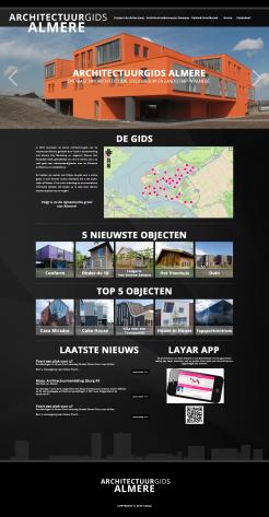
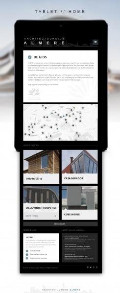
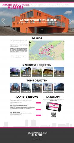
I like the white background on the last design only the magenta is to much, the black is maybe to much in this design.
This contest is finished. Its not possible to reply anymore.
Beste,
Hierbij een eerste inzending van het website design. Dit betreft de Home pagina.
Ik ben benieuwd naar uw feedback.
Groet,
Benji
Hello Benji,
I like the design, clean and good overview. Only the colours are to much like the old website and book.
This contest is finished. Its not possible to reply anymore.