 Nederland
 België
 France
 Deutschland
 Österreich
 International
No comments
Website Design Solowski Consultancy BV
- Contest holder: JSolowski
- Category: Website design
- Status: Ended
- Files: File 1
Start date: 27-10-2020
Ending date: 01-12-2020
Total budget: € 499.00
Latest design
It all started with an idea...
A short, interactive guide helped them discover their design style and clearly captured what they needed.
Brandsupply is a platform where creative professionals and businesses collaborate on unique projects and designs.
Clients looking for a new logo or brand identity describe what they need. Designers can then participate in the project via Brandsupply by submitting one or more designs. In the end, the client chooses the design they like best.
Costs vary depending on the type of project — from €169 for a business or project name to €539 for a complete website. The client decides how much they want to pay for the entire project.
Designer:
 solaram
This contest is finished. Its not possible to reply anymore.
No comments
Dear Solarm, thank you for your design. I will discuss it witm my employees and will come back on the design at the beginning of next week. Kind Regards Jarek Solowski
hello Mr. Solowsk,
thank you for your answer, i'll eagerly wait for your feedback, in the mean time i've been working on alternative version, that i'll post shortly.
best regards,
Solaram
This contest is finished. Its not possible to reply anymore.
No comments
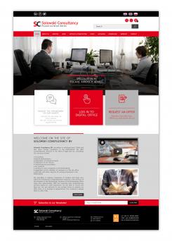
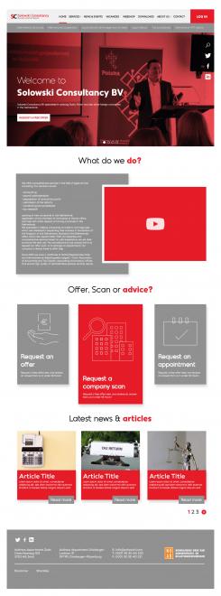
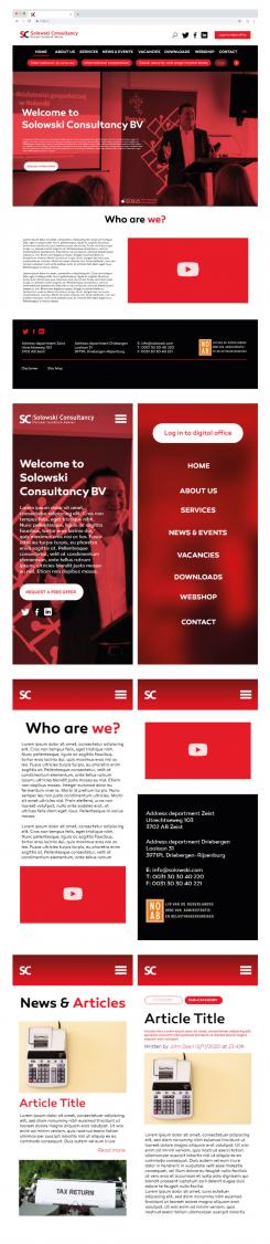
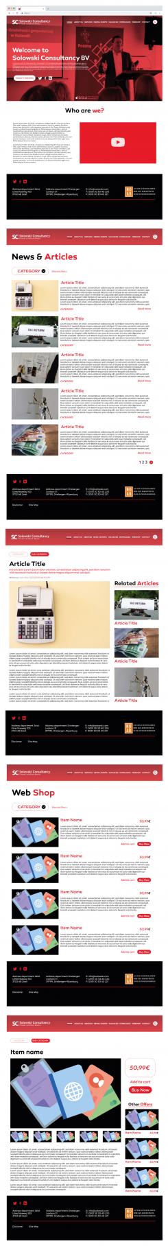
Hello!
Here's my entry for your contest i tried to go with a modern approach while leaving some core aspect of your previous website.
As such i would like to explain some details of my design:
my focus was "less is more", as simple as possible, more space, more openness, large unified color spaces, the secondary nav bar was removed for simplicity and improved user experience (to avoid overwhelming the user, however another version with it will be posted shortly along side the mobile version)
the font is geometric and slightly rounded inviting trust and seriousness
the main page is a full scale automatic carousel, which shifts every 3 seconds, (3sec attention span principle)
Thank you very much for your attention, i remain at your disposition for any kind of request or remark
Best regards,
Sol.
This contest is finished. Its not possible to reply anymore.