Nederland
 België
 France
 Deutschland
 Österreich
 International
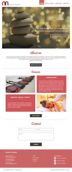
Beste Diana,
Bij deze mijn ontwerp voor de homepage. Het ontwerp straalt kalmte en rust uit en ziet er modern en professioneel uit. Voor een persoonlijke touch heb ik voor de kopjes About, Services en Contact een handgeschreven lettertype gekozen, maar mocht dit u niet aanspreken dan is dat natuurlijk gemakkelijk te veranderen.
Ik heb veel gebruik gemaakt van het rood op uw huidige website, omdat ik de softe tint vind passen bij het ontwerp. Het rood uit uw logo is misschien iets te heftig, dus die heb ik spaarzaam gebruikt.
Ik hoop dat het ontwerp u zal aanspreken. De wedstrijd loopt bijna af, maar mocht u na de wedstrijd voor mij kiezen dan zijn aanpassingen natuurlijk gewoon mogelijk, evenals het ontwerp voor de andere pagina's, totdat alles naar volledige tevredenheid is.
Met vriendelijke groet,
Michelle
______________________________________________________________________________________________________
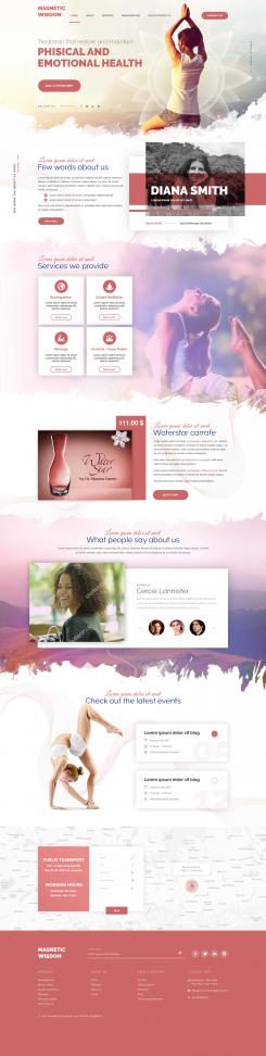
Dear Diana,
This is my design for the homepage. The design radiates calmth and peace. It looks modern en professional. For a personal touch I've used a handwritten font for About, Services and Contact. This is easily adjusted if you don't like it.
I've made use of the red of your current website, because I think it suites the design. The red used in your logo might be a bit to harsh.
I hope you like my design. The deadline for the contest is tonight. If you were to choose for me I'm of course more than happy to adjust the design to your liking, including the design for the other pages.
Kind regards,
Michelle
Website for Energetic Medicine Company
- Contest holder: di_ezgo
- Category: Website design
- Status: Ended
Start date: 24-02-2017
Ending date: 03-03-2017
It all started with an idea...
A short, interactive guide helped them discover their design style and clearly captured what they needed.
Brandsupply is a platform where creative professionals and businesses collaborate on unique projects and designs.
Clients looking for a new logo or brand identity describe what they need. Designers can then participate in the project via Brandsupply by submitting one or more designs. In the end, the client chooses the design they like best.
Costs vary depending on the type of project — from €169 for a business or project name to €539 for a complete website. The client decides how much they want to pay for the entire project.